
Valerio Dewalt Train
For VDT’s 20th anniversary, the studio selected a small group of in-house designers to reimagine its brand strategy. My focus was redesigning buildordie.com, which suffered from a desktop-only design, a clunky user experience, and a complicated CMS.
What I did: research, user experience design, content strategy, content design, visual design, project management
Original design
VDT's website was designed in 2009, before responsive design was commonplace. It primarily acted as an archive, with projects organized into dense, multi-layer hierarchies.


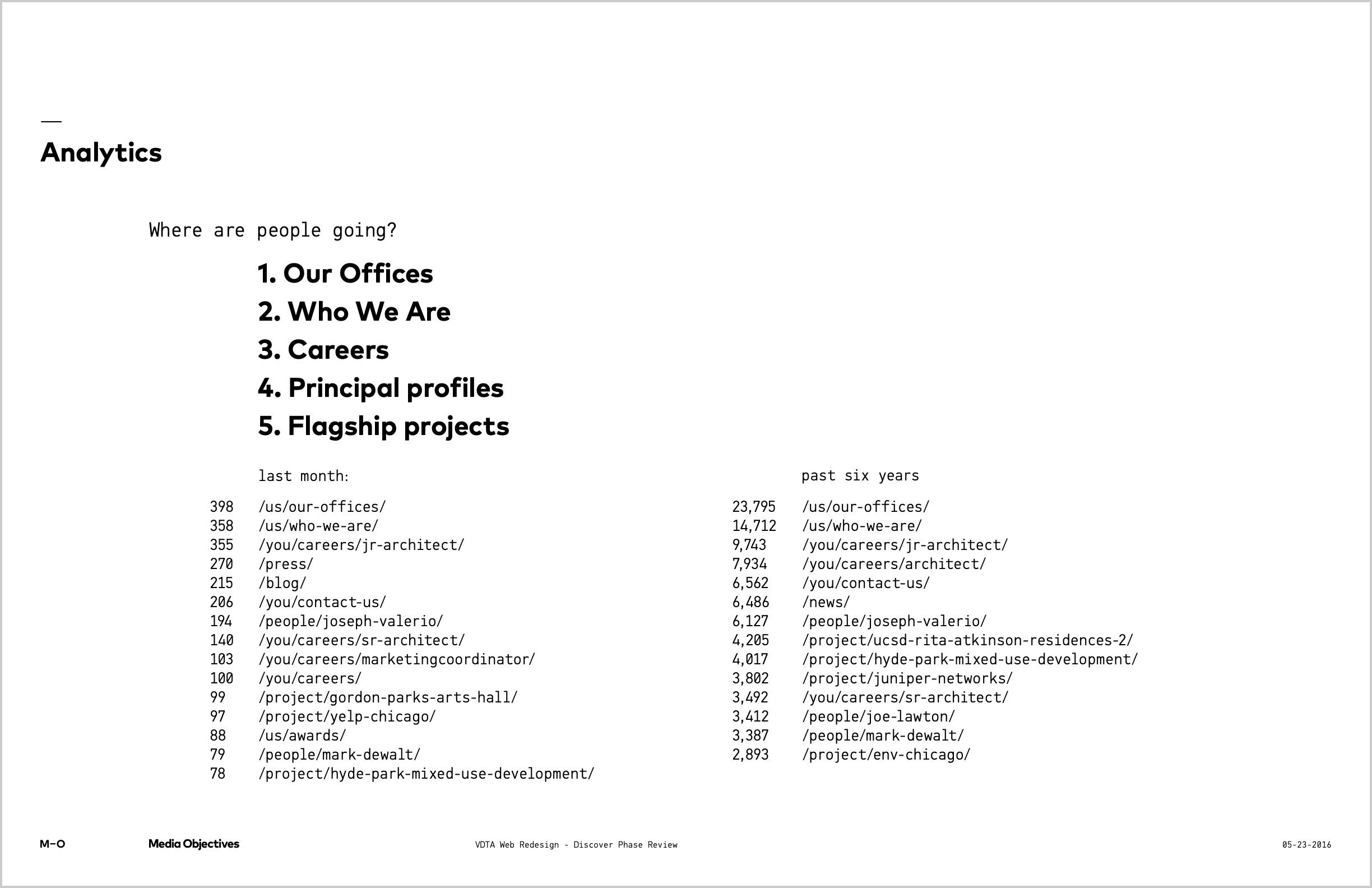
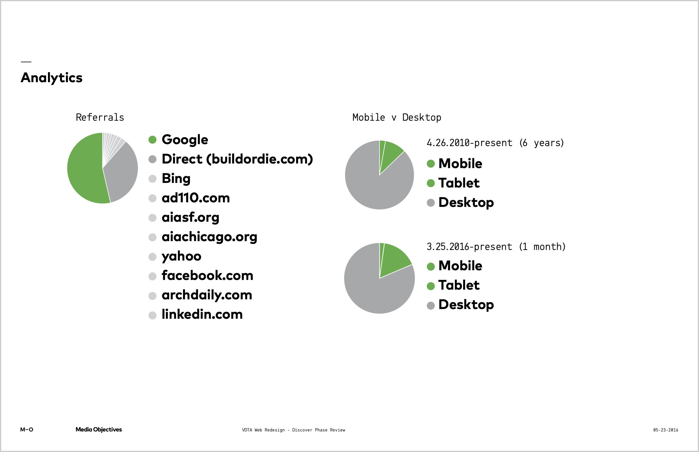
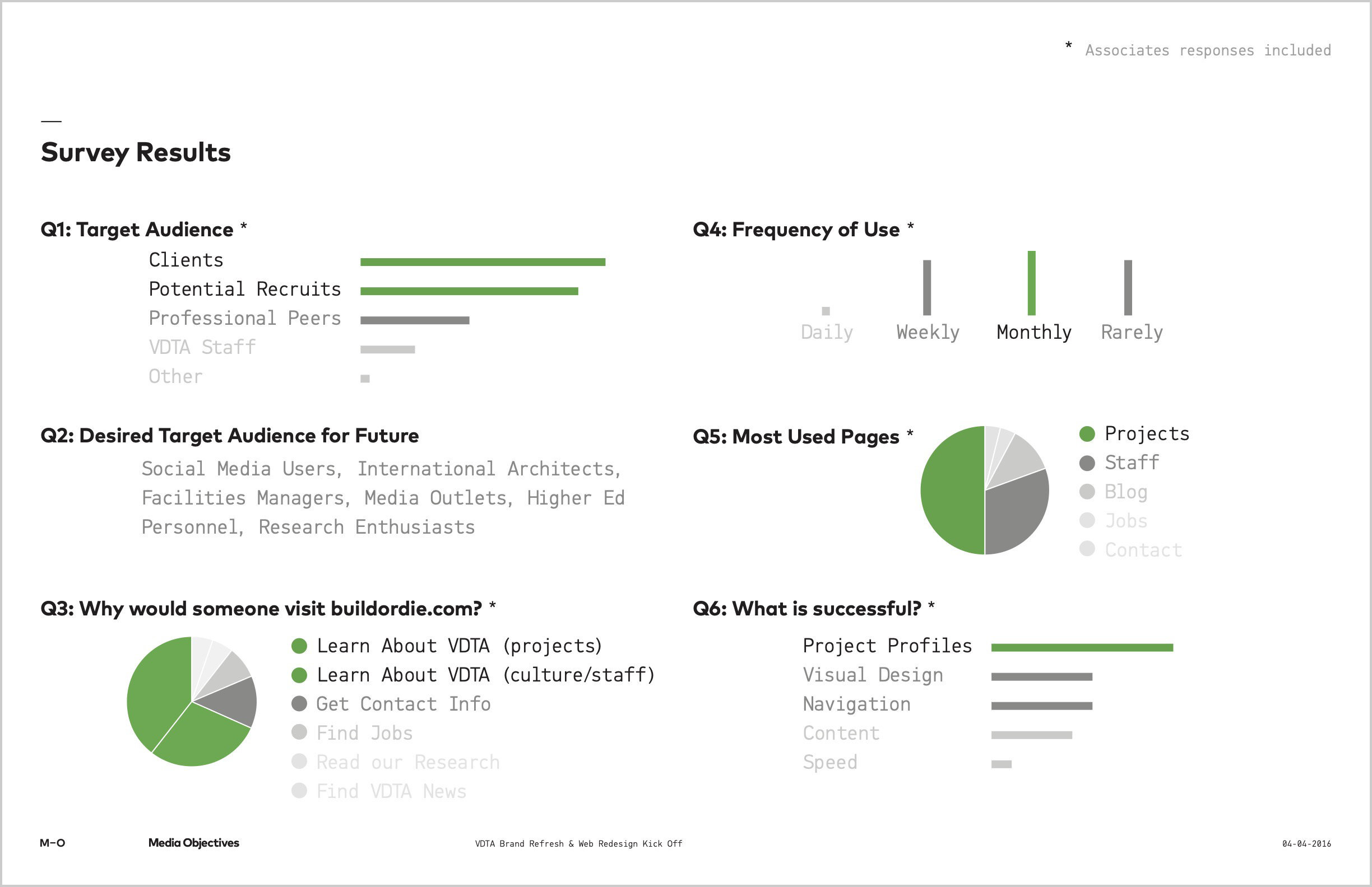
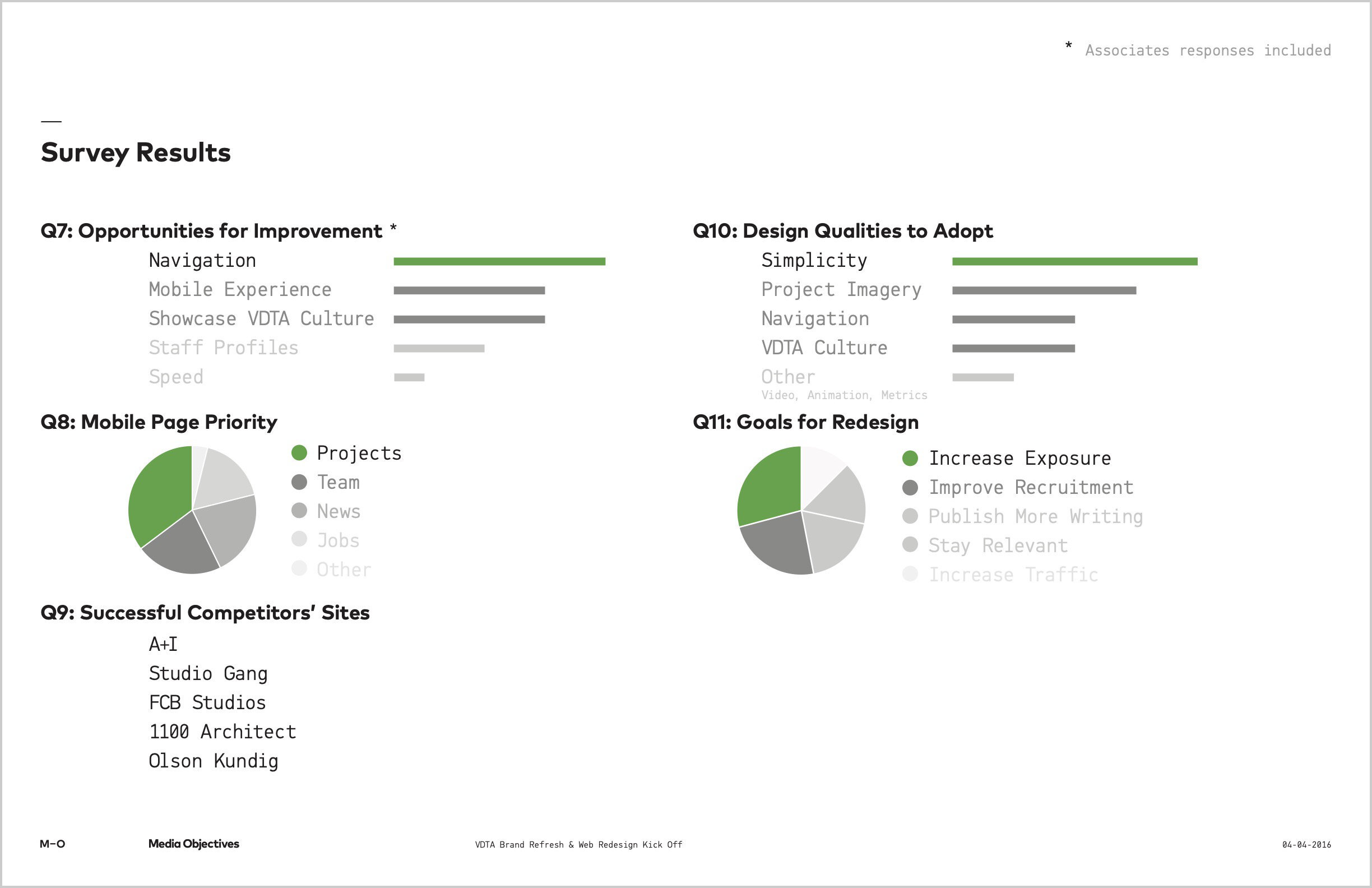
Discovery
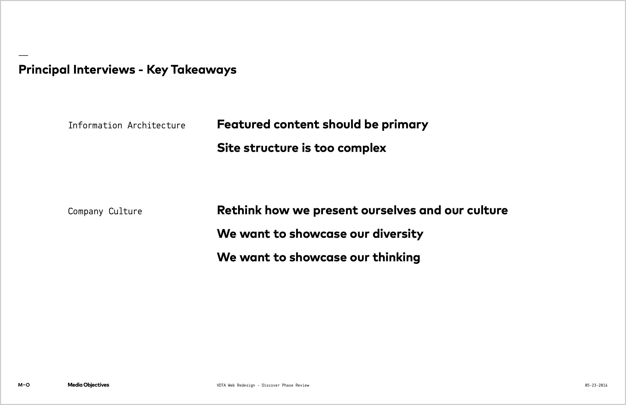
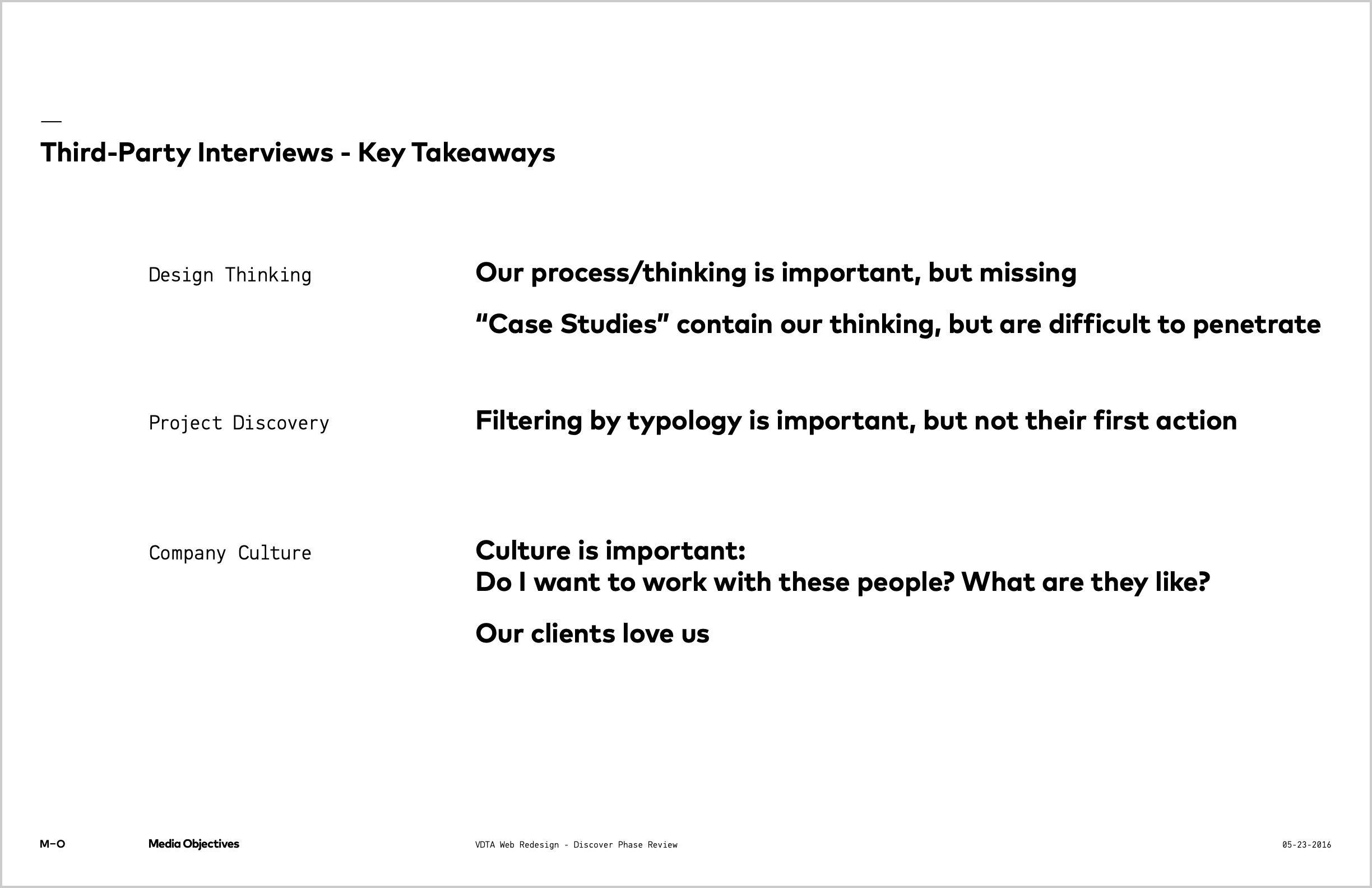
To understand the full scope of issues and set goals, I surveyed employees and clients, interviewed principals and business partners, and analyzed the site's traffic.

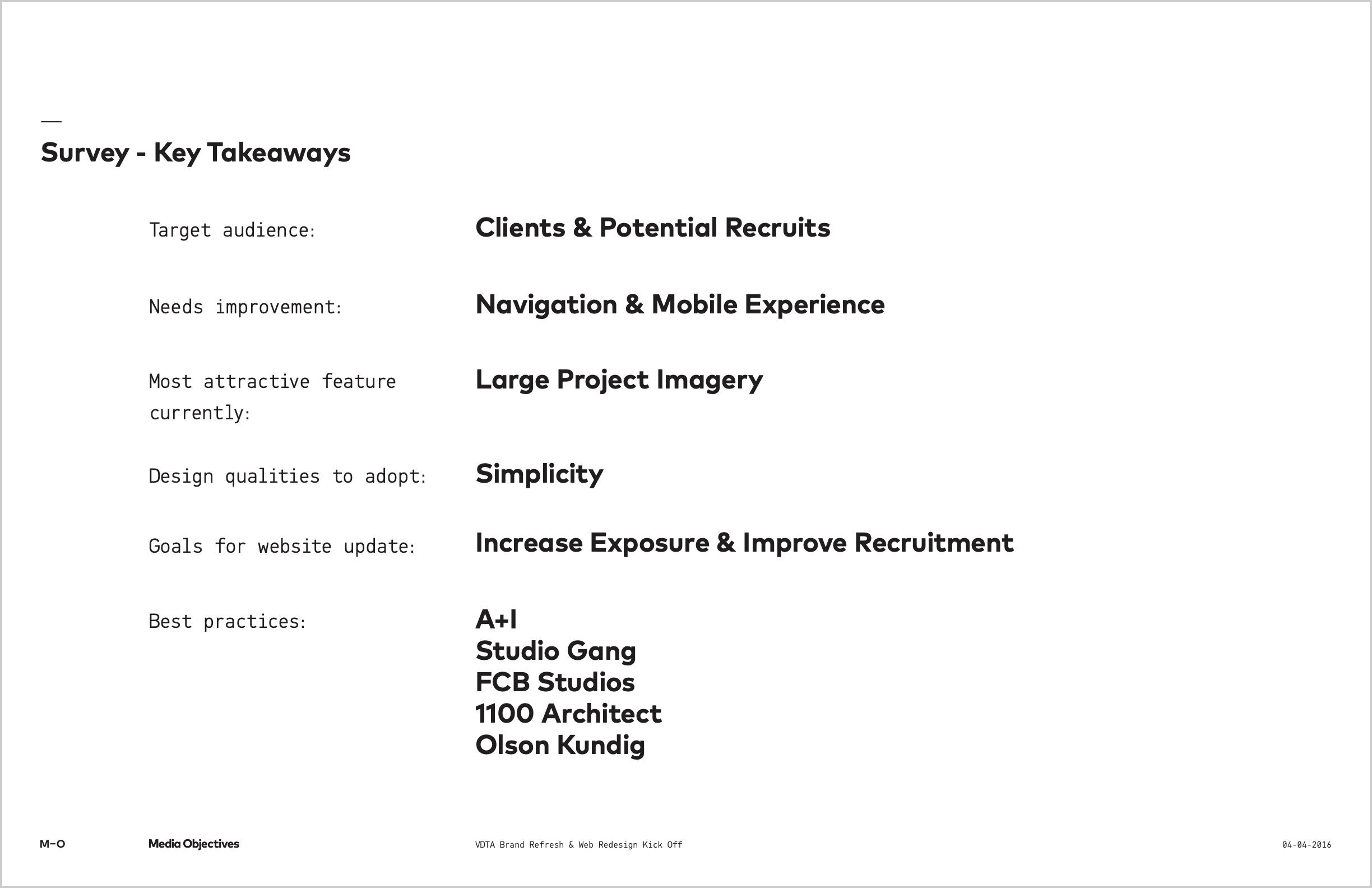
Goals
After presenting all the findings, the studio principals were unified on three goals for the redesign.
The new website will:
- Attract new clients
- Improve recruitment
- Reestablish the studio's relevancy
Audience
The goals of the redesign focused on two types of users and their end goals.
Potential clients
Age range- 40-60
- Facilities management
- Higher education
- Housing development
- Mobile
- Desktop
- Find projects in their industry
- Learn about leadership
- See achievements and accolades
Potential recruits
Age range- 20-30
- Recent college graduate
- Early in architecture career
- Mobile
- Desktop
- Understand the company culture
- Browse an assortment of project types
Inventory
Much of the friction stemmed from a messy content architecture, so I audited the site’s content and identified usability issues. I also audited competitors and presented their content's strengths and weaknesses.


Design principles
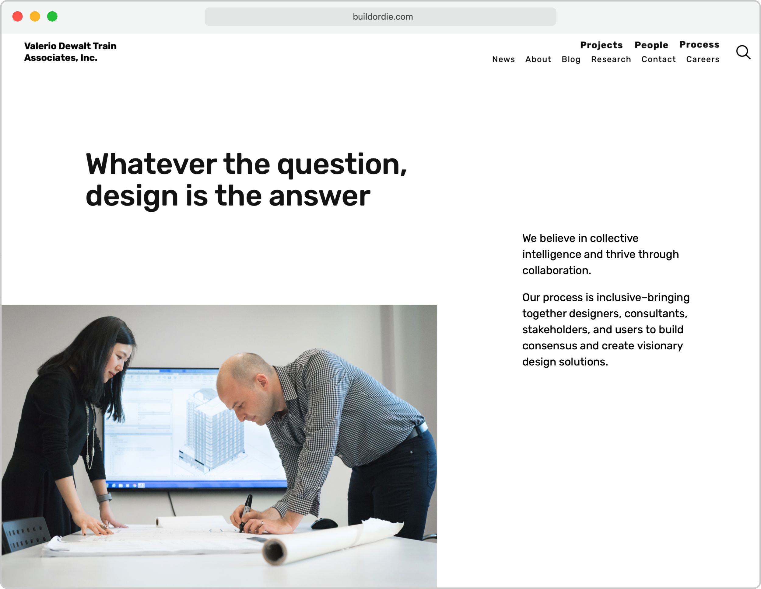
To achieve the goals of attracting new clients and talent, we defined guiding principles for the new design. These principles focused on the experience of our target audience and their end goals.
The design will:
- Strive for simplicity and clarity
- Push content to visitors rather than make them find it, but...
- Make content discovery enjoyable
- Showcase our thinking, process, and company culture
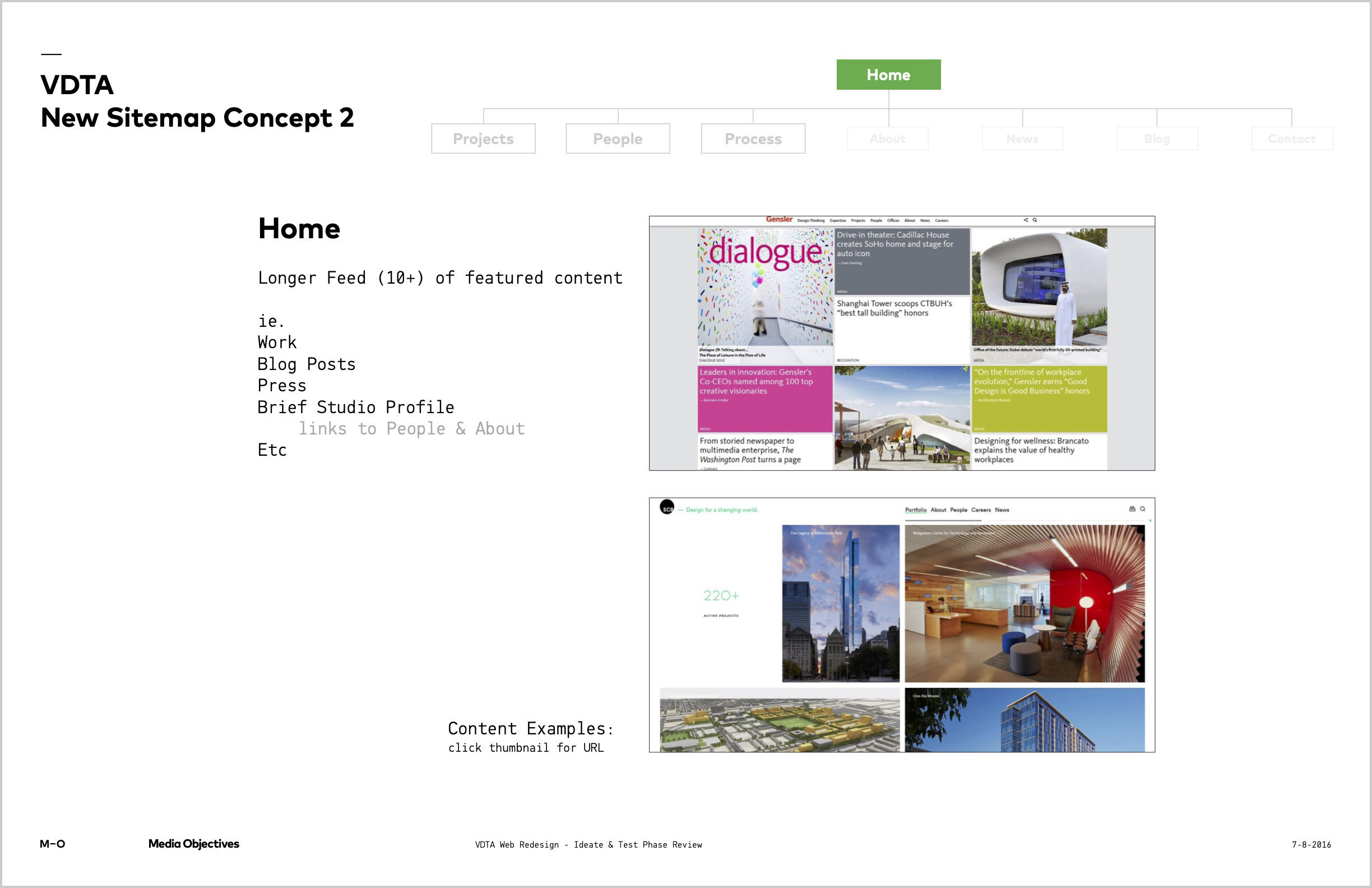
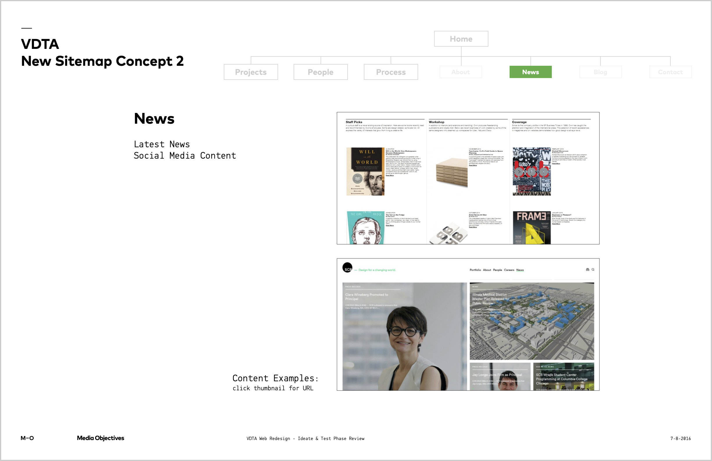
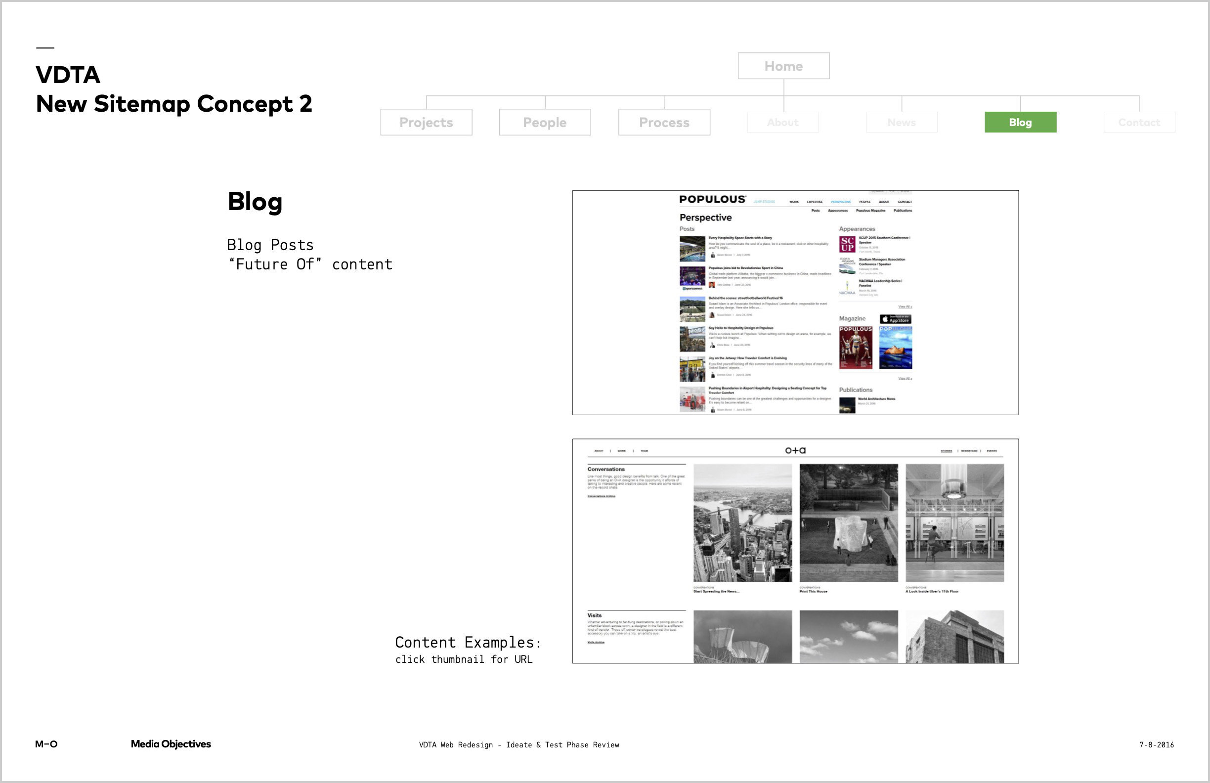
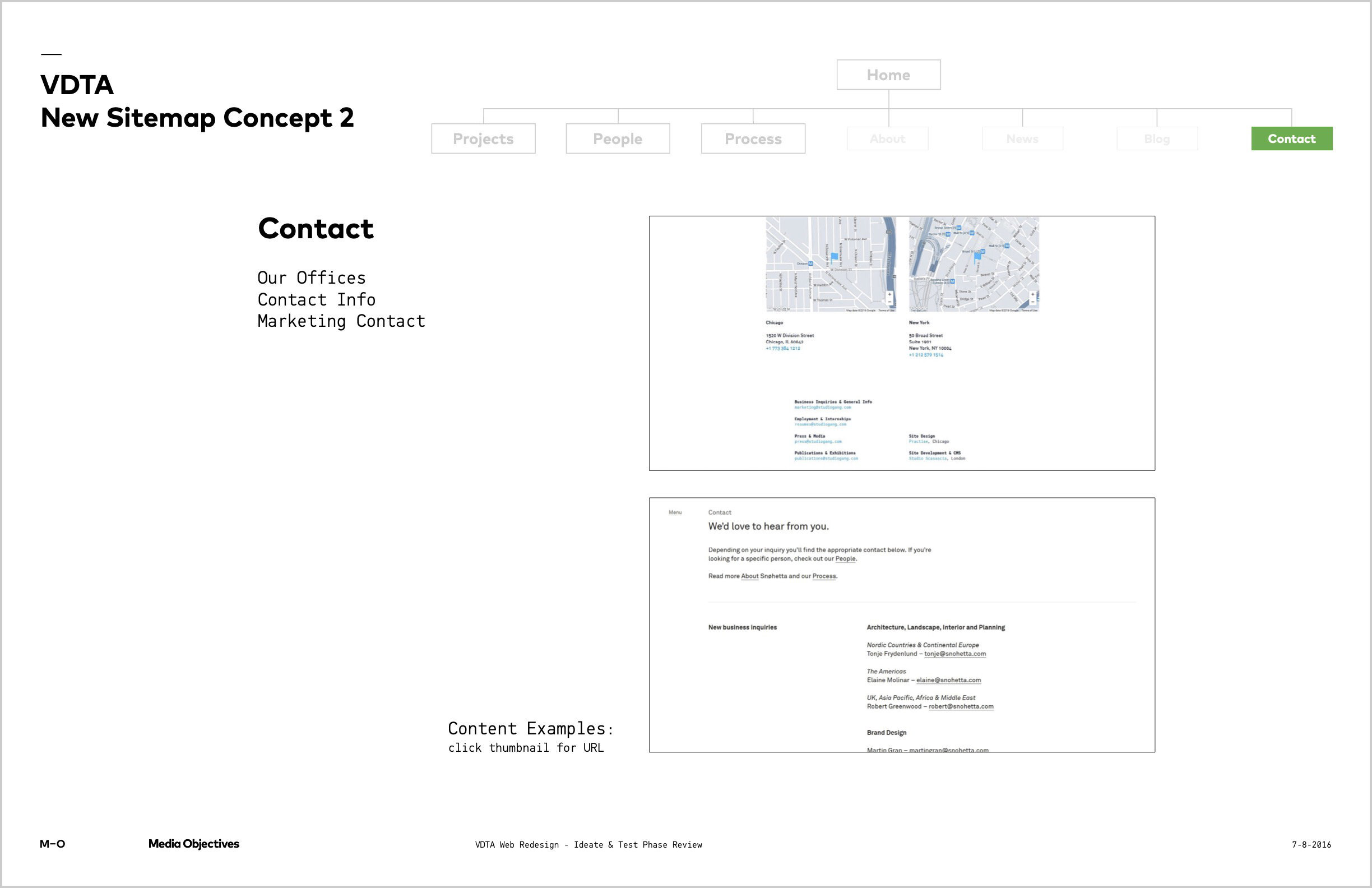
Content architecture
We wanted to make exploring the site more pleasurable and finding known content easier. The new site reorganized content to better serve these different navigational modes.
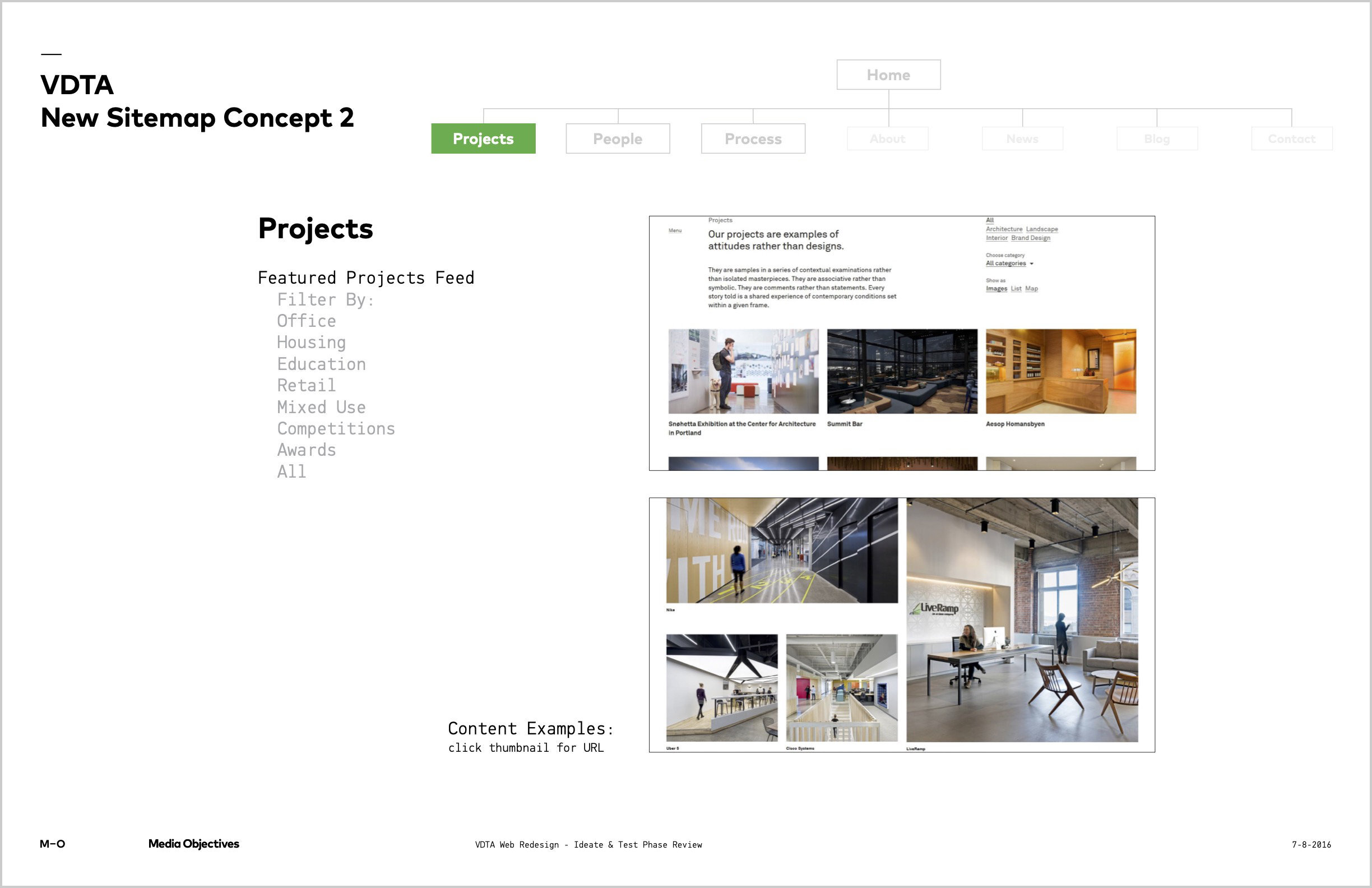
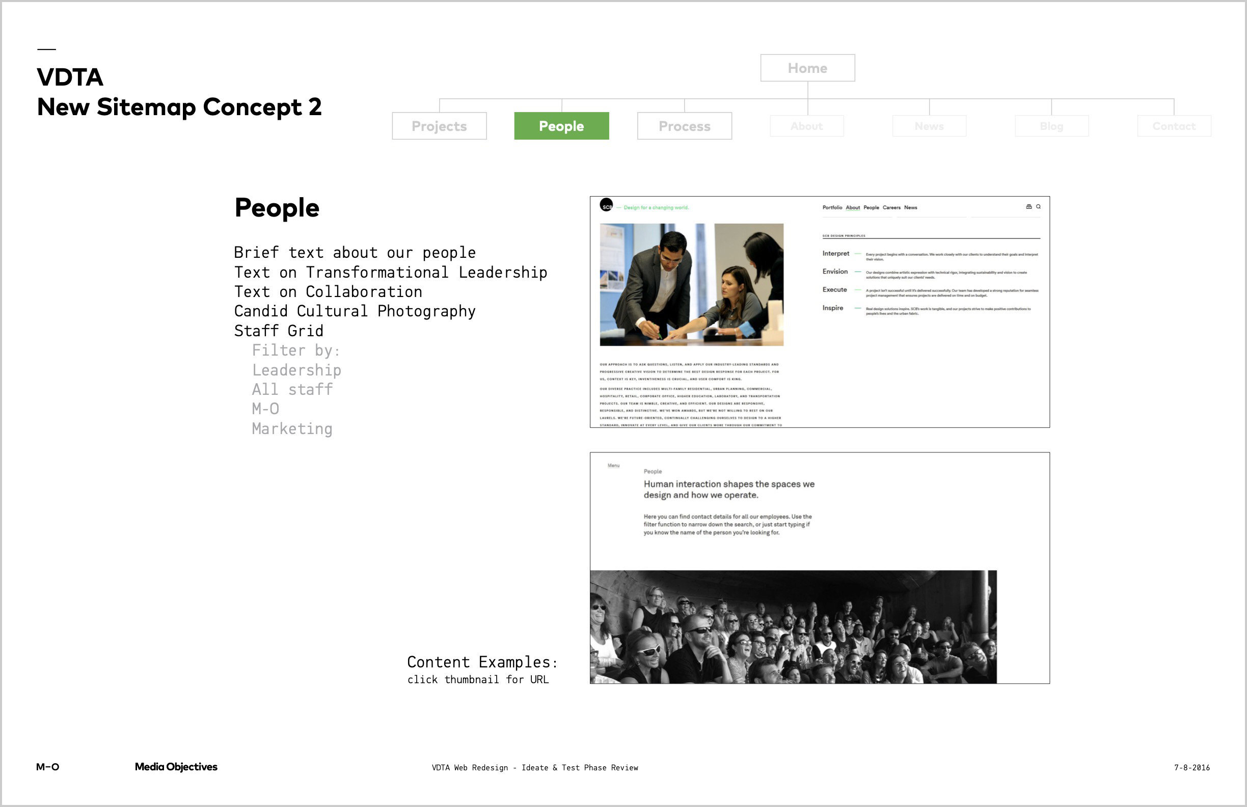
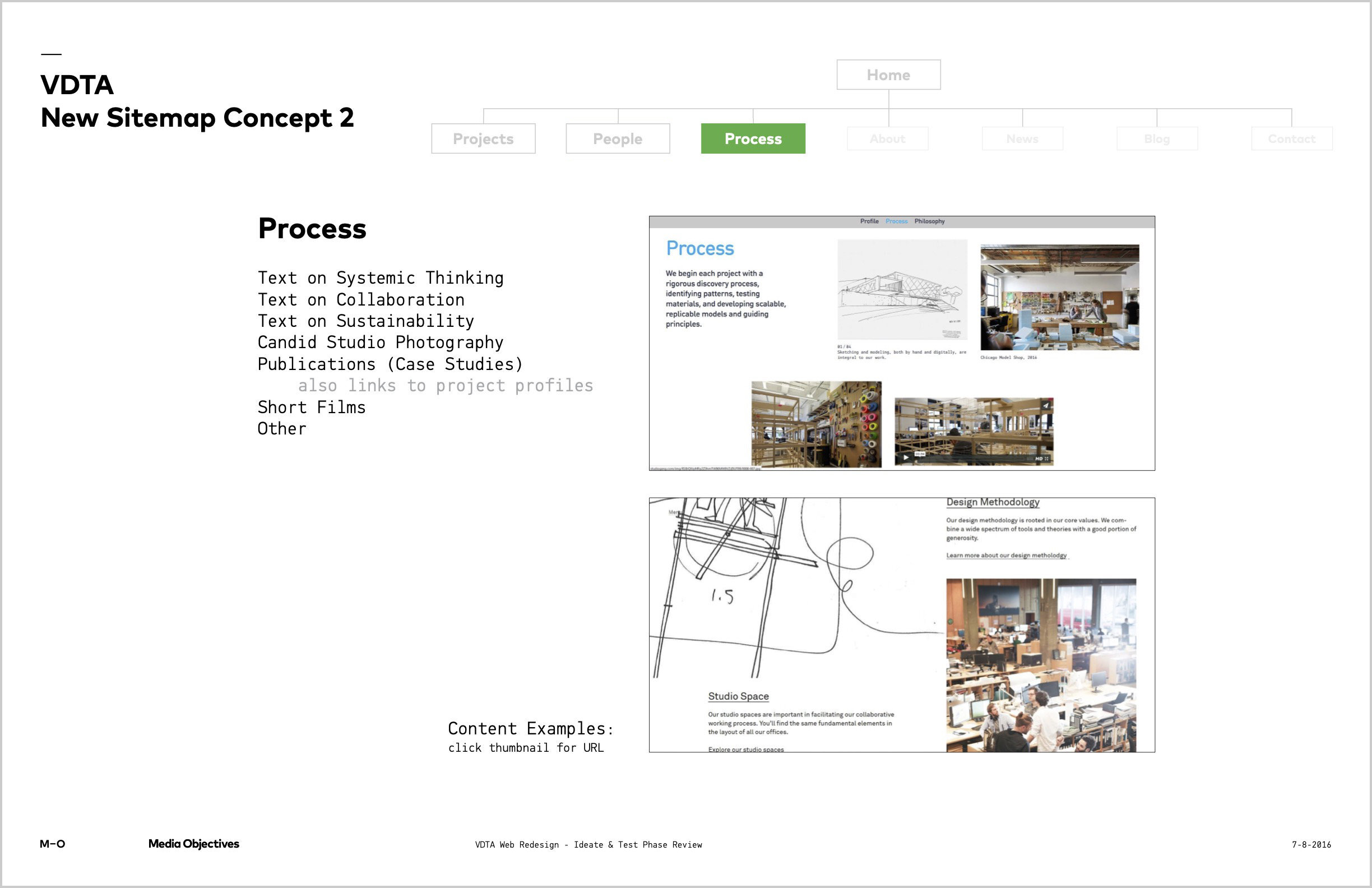
Main navigation: Projects, People, Process
The main navigation prioritizes content that our target audience said was most important. The labels are clear, they’re visually distinct from the secondary nav, and they use alliteration to create a satisfying, parallel set of three.
Landing page feed
The landing page features a curated feed so the studio can serve up content targeted for their audience. It also lets the studio regularly update the homepage with minimal development, providing a fresh experience for returning visitors.
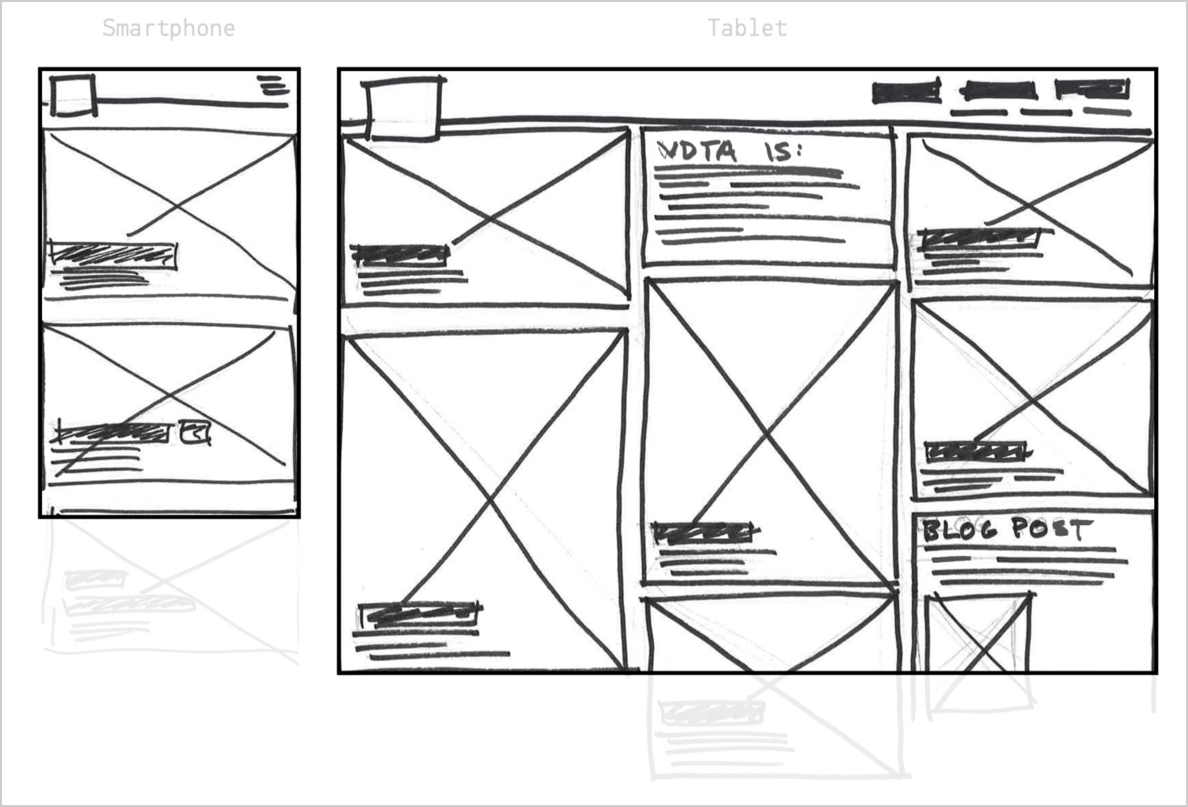
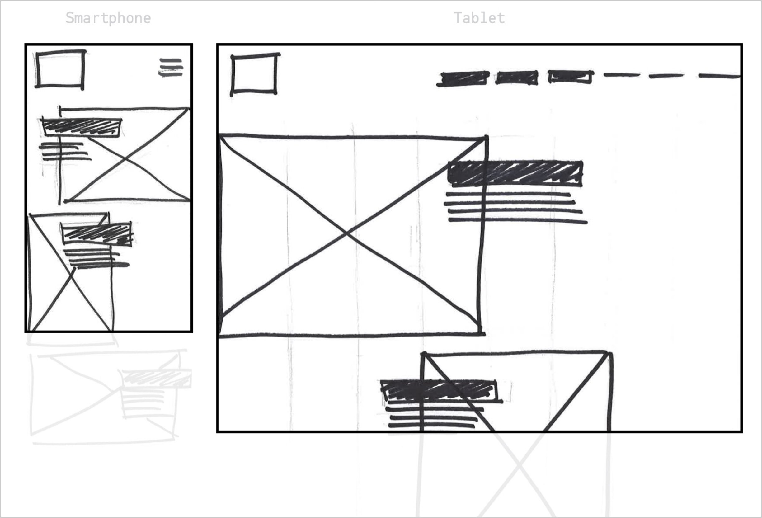
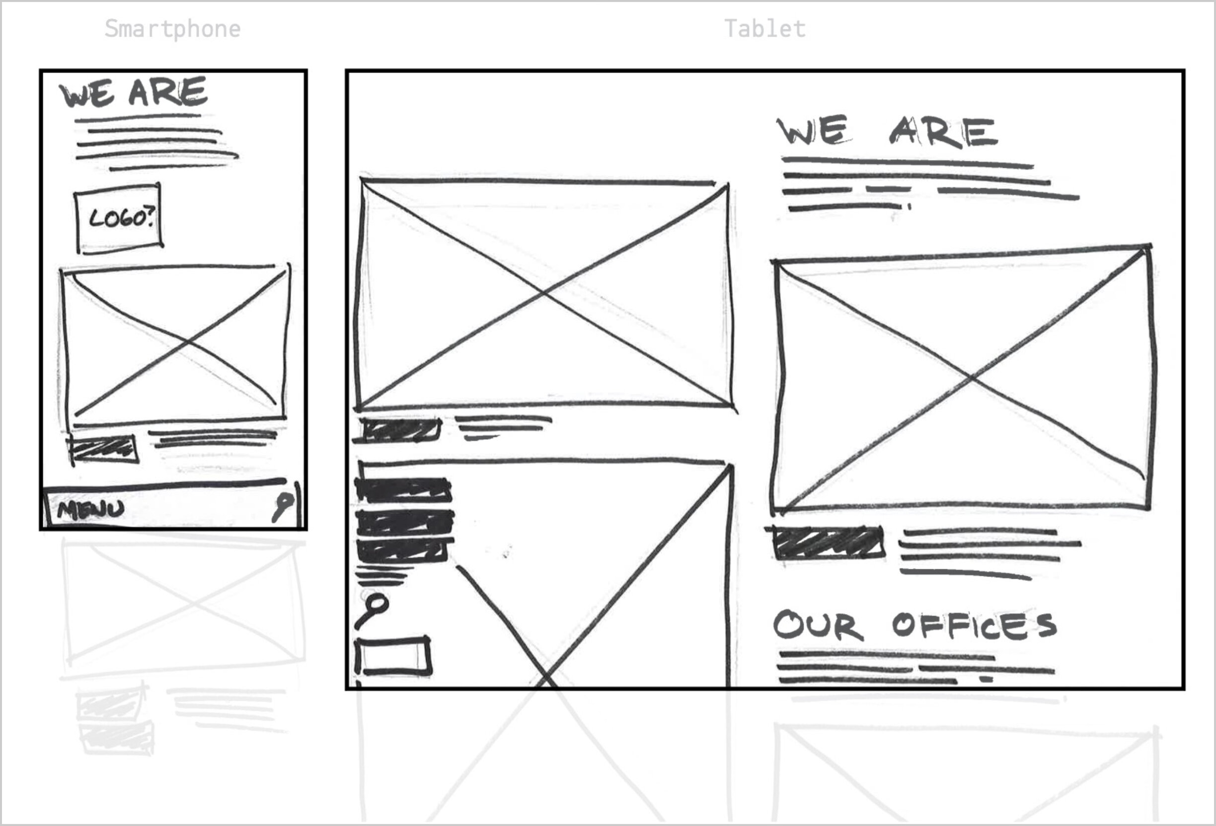
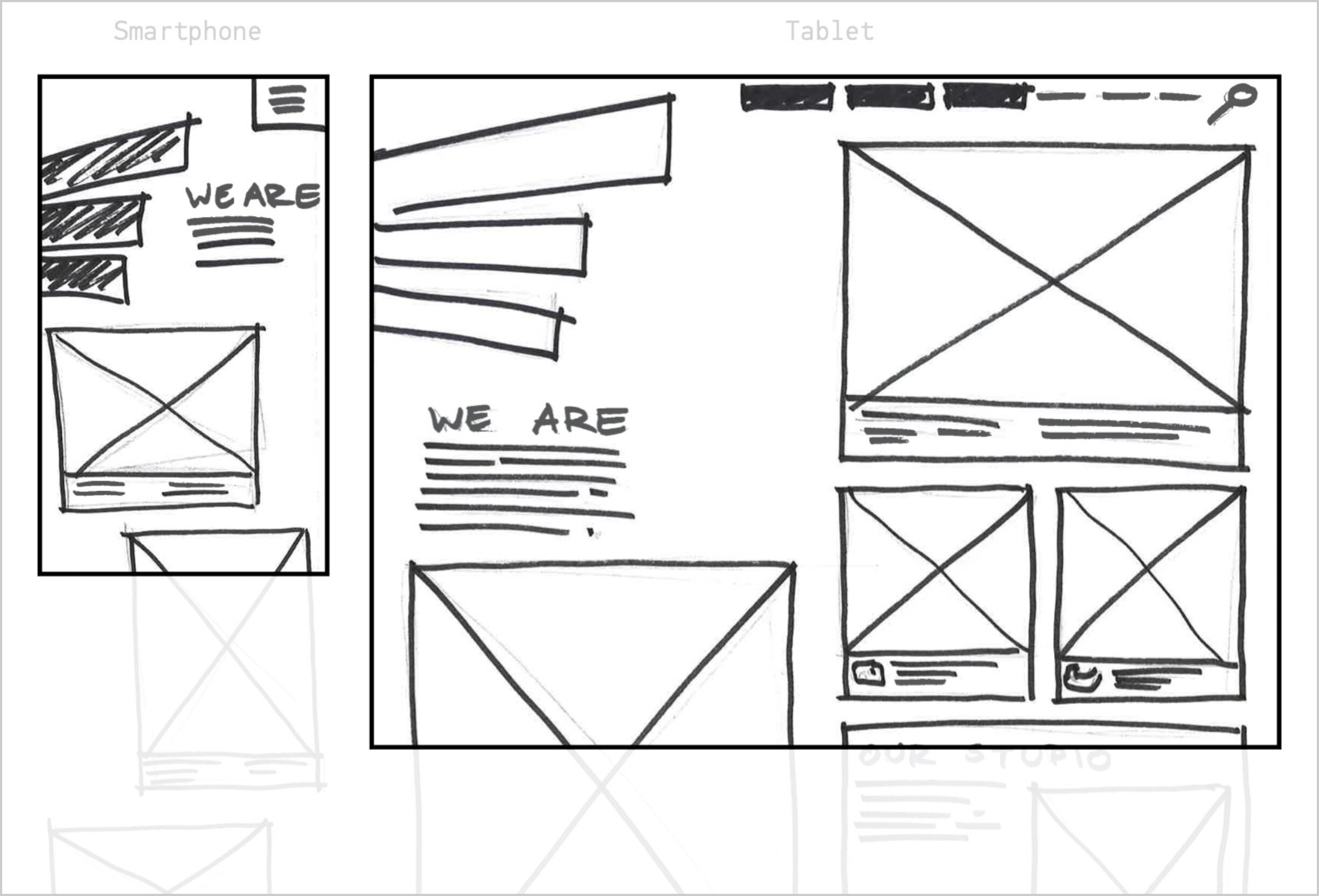
Wireframes
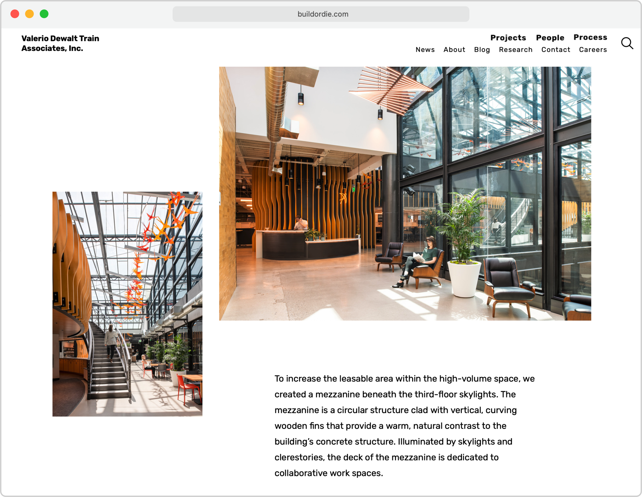
We wanted content like project photography, case studies, and blog posts to be front and center so our users were immediately presented with what they were looking for. With this in mind I started wireframing UI concepts that focused on large floating images and headers in generous white space.
Telling Stories
Much of the site’s content was rewritten and restructured to tell more compelling stories to our audience. Profiles of the company and projects are told in shorter, more digestible paragraphs that are complimented by relevant photography. This new approach feels casual yet confident, traits that reflect the culture at the company.
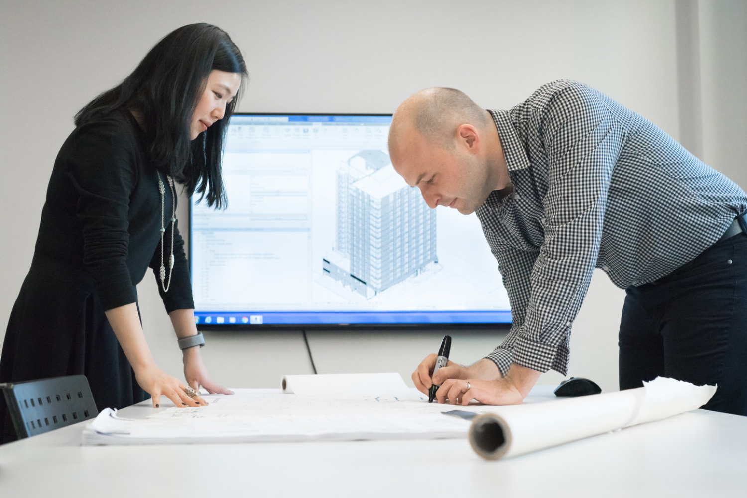
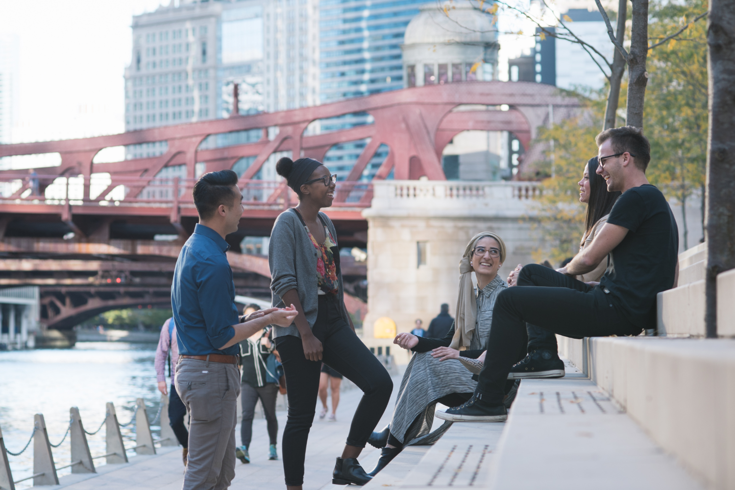
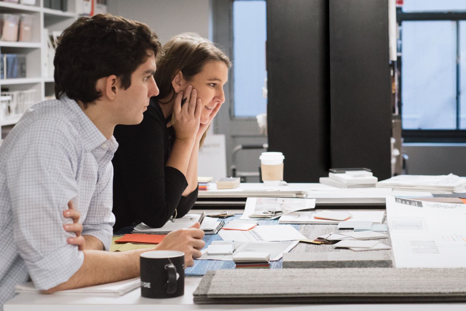
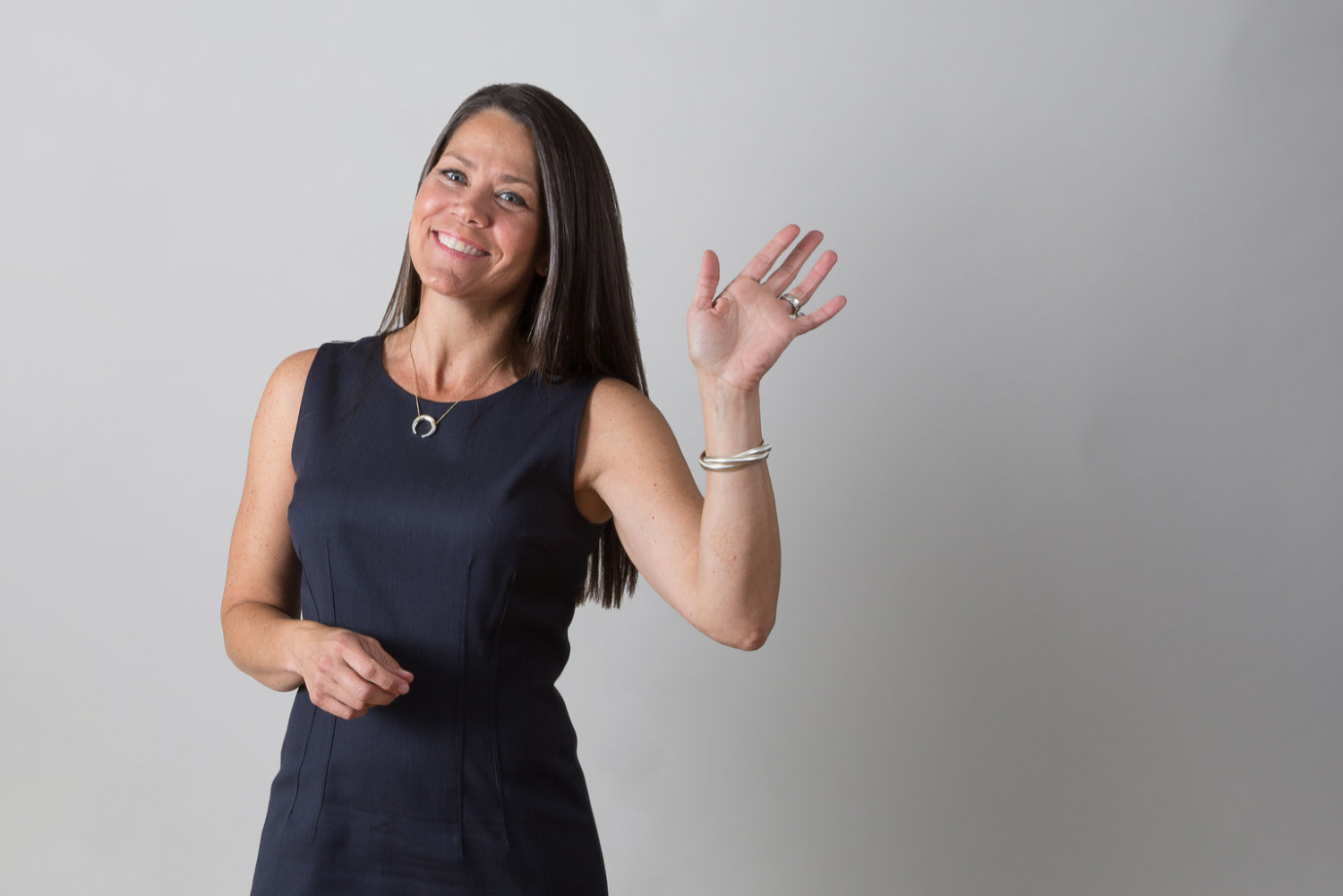
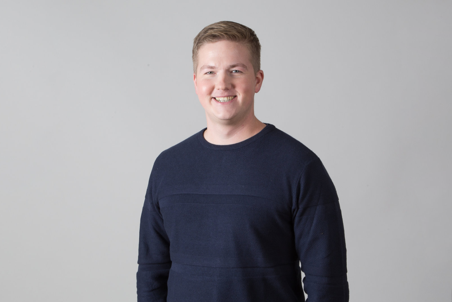
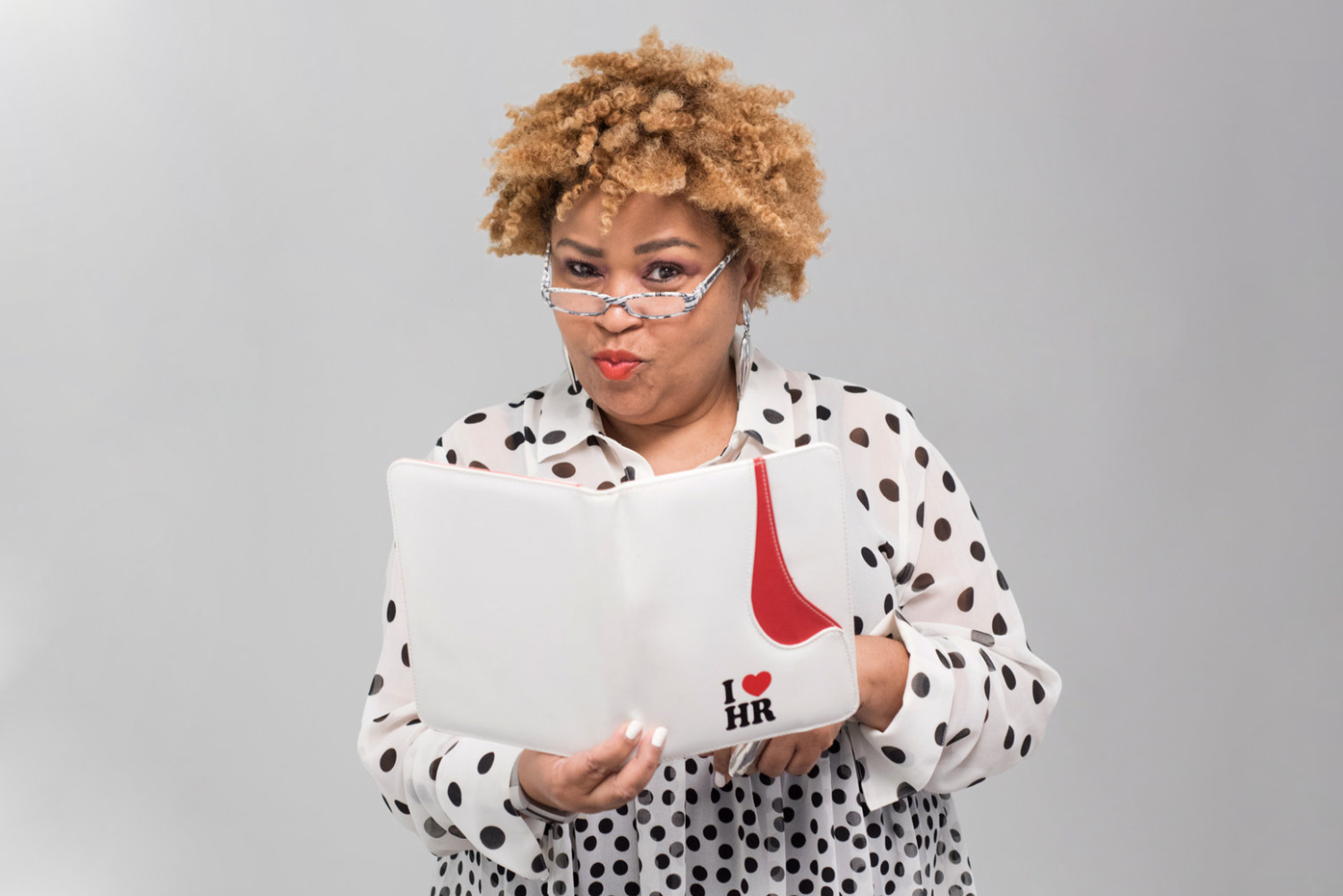
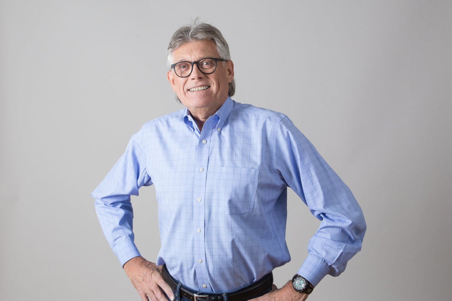
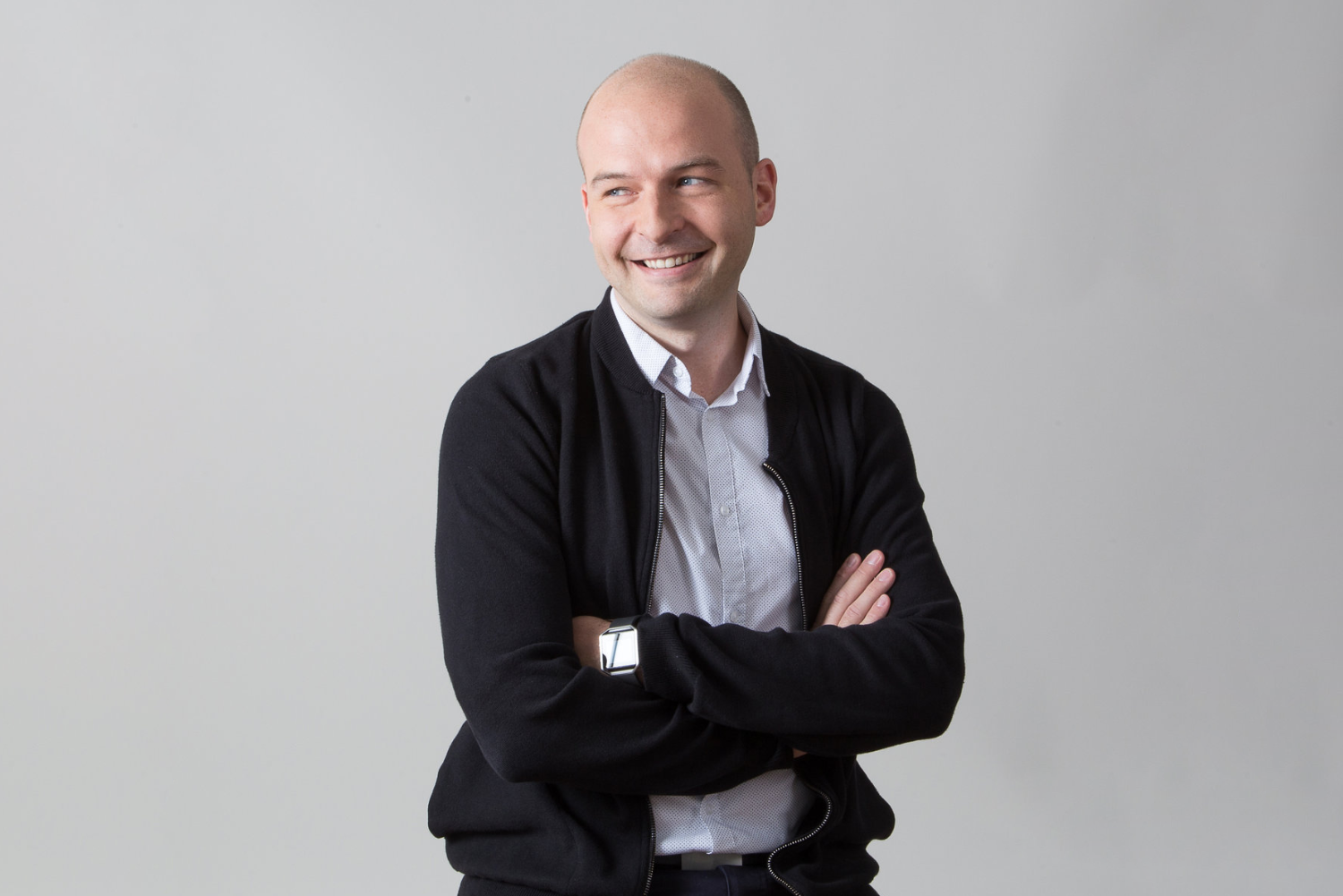
Art direction
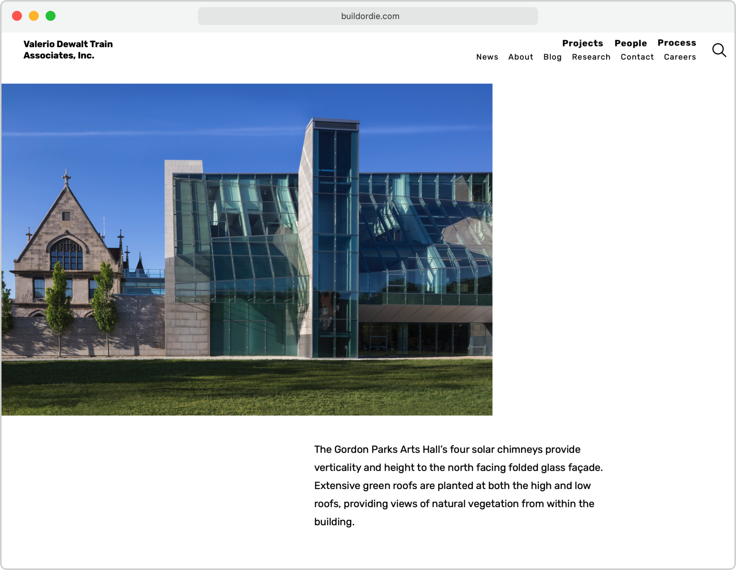
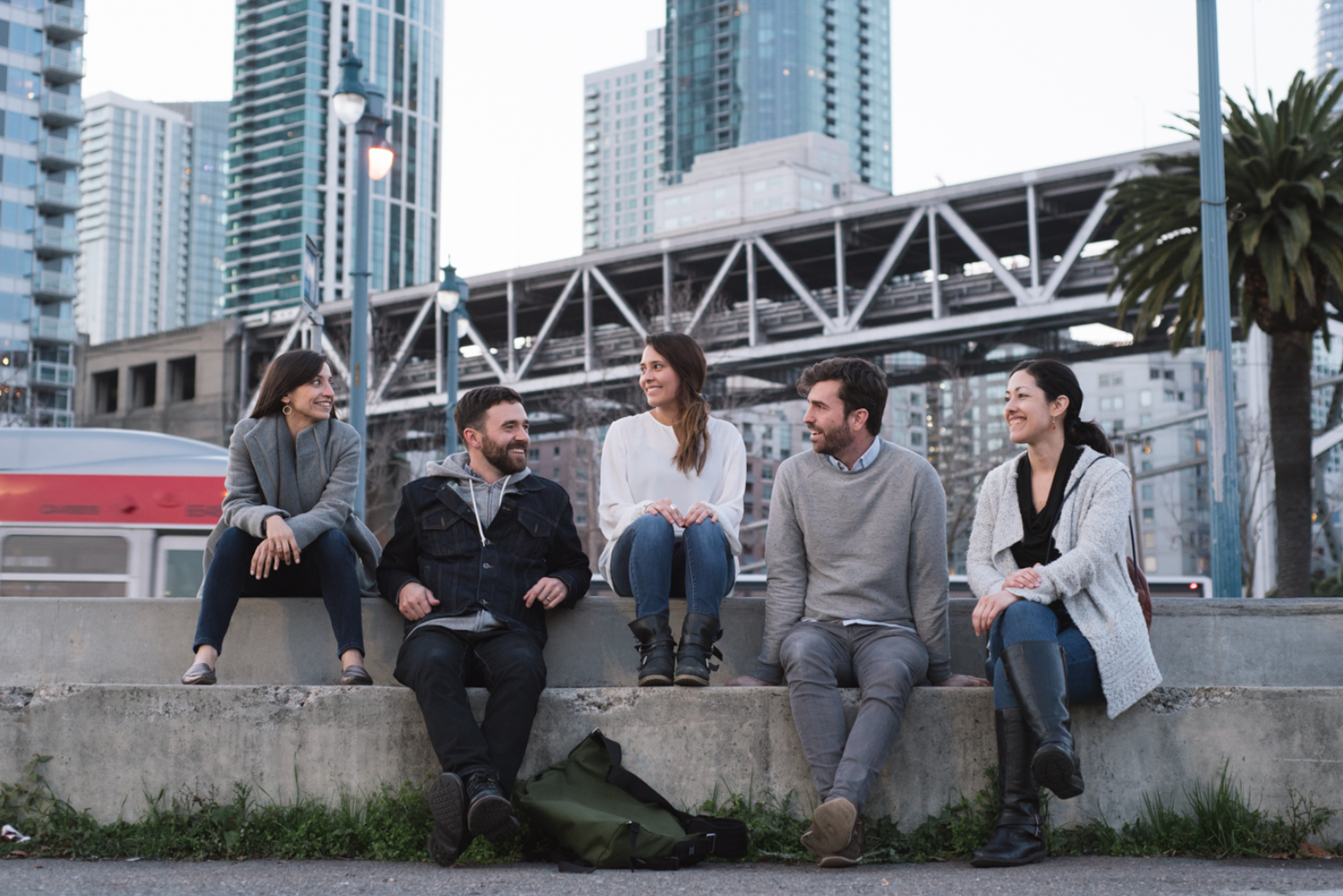
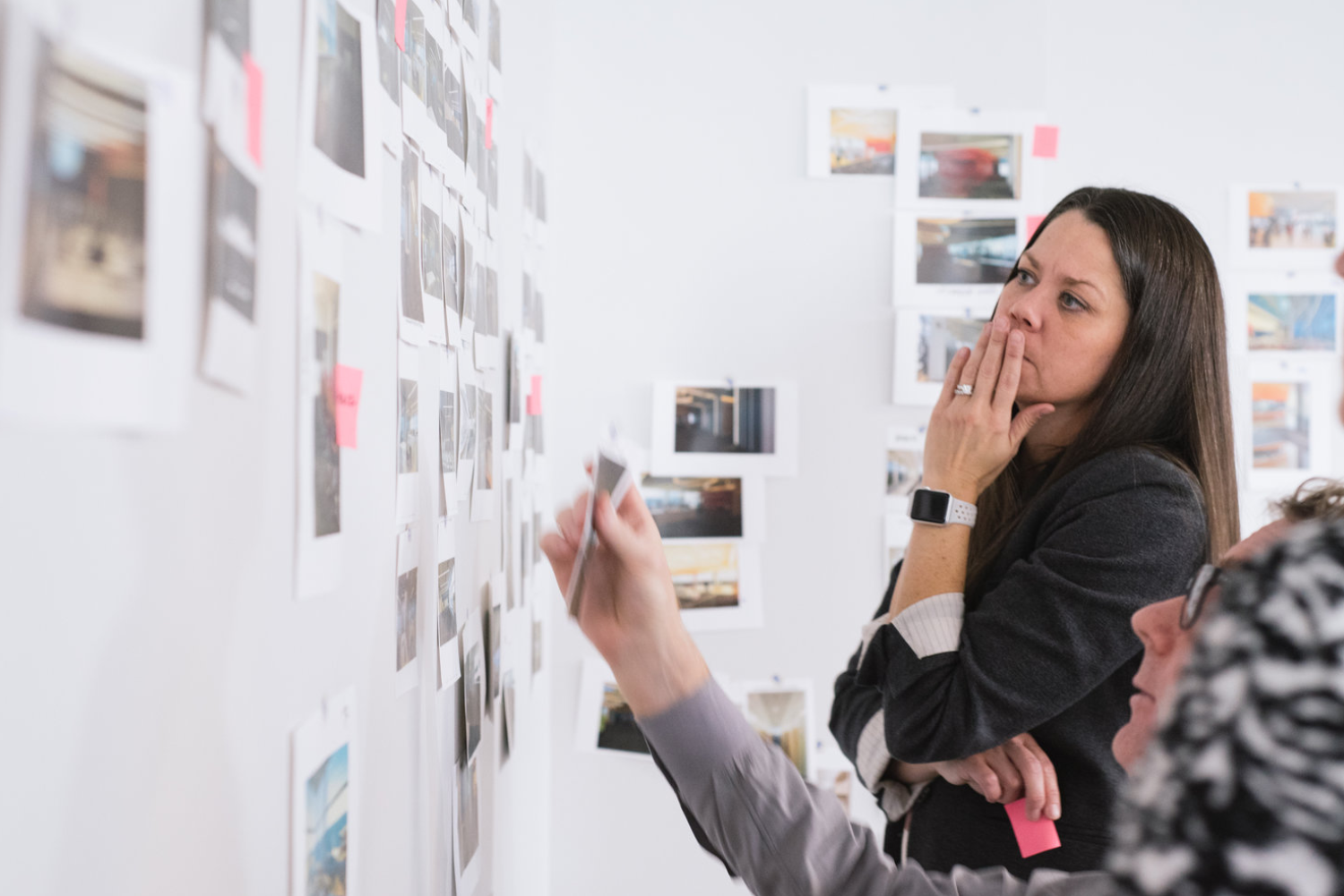
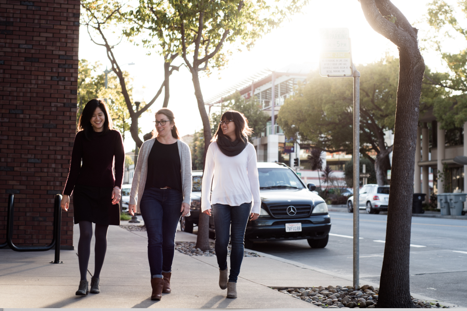
Part of revamping the site’s content was rethinking its use of photography. I art directed photoshoots with the goal of complimenting stories on the site, and capturing the studio’s brand attributes of ingenuity, vitality, tenacity, and authenticity.
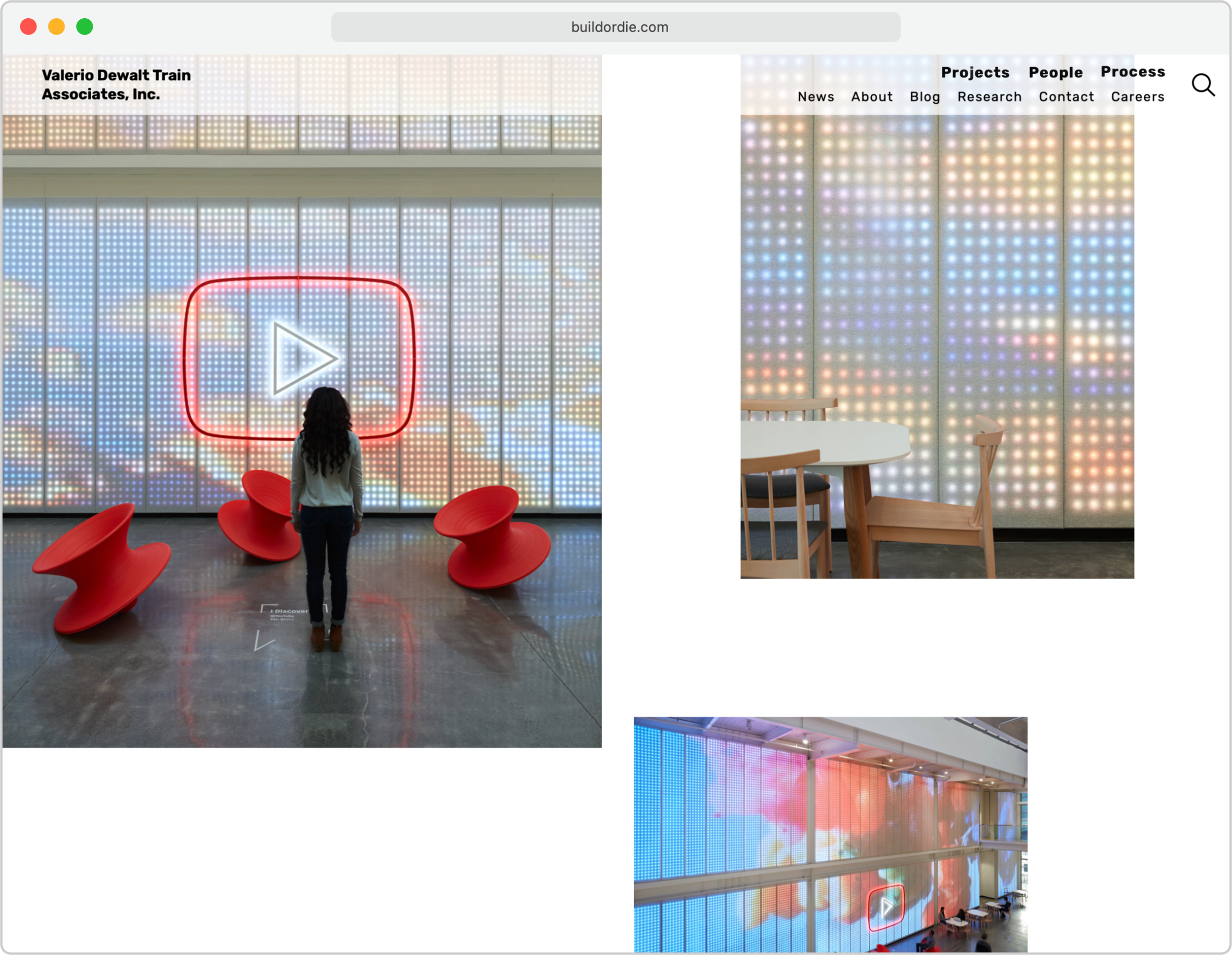
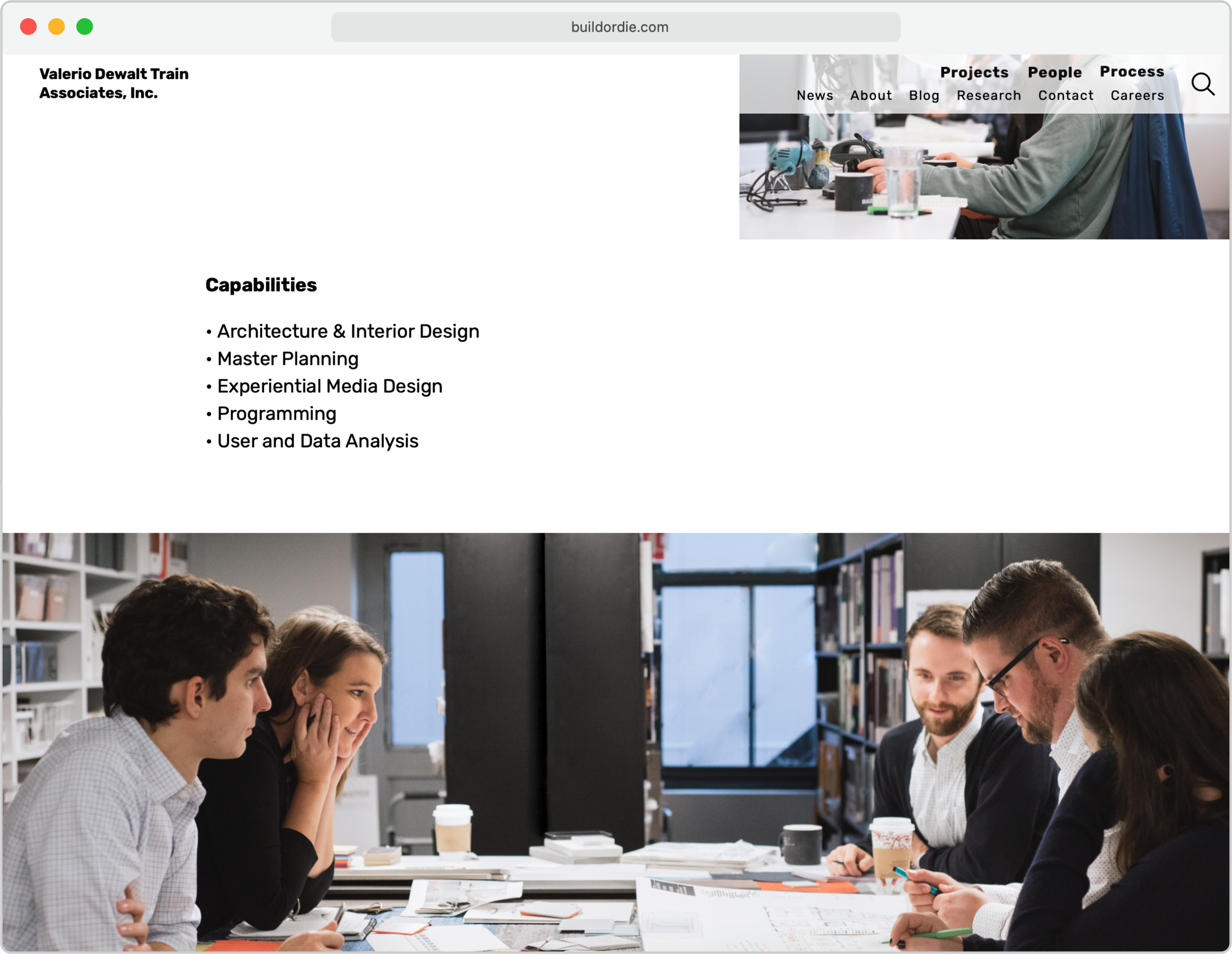
Final product
The new site went live in 2017. Some of its successes include:
- Recruitment leads increased in the first two years after launch, with junior applicants making up the majority of the increase
- An instant feeling for the firm's culture, with featured content like new projects and blog posts on the landing page
- Content that's more up-to-date thanks to migrating to a user-friendly CMS, so users have a sense of trust and reason to return
- A flattened content architecture and improved search that make browsing far easier and more enjoyable
- A fresh and light UI that puts the content front and center, and showcases the firm's passion for design
- A mobile experience that equals the desktop experience
Visit buildordie.com


More work

UX writing
Words for user interfaces

SEGD15
A lightweight mobile guide for SEGD's national conference

Spectrum
A striking wayfinding system for Adobe

Other stuff
Fine art, logos, music videos, and a bunch of other stuff