
SEGD15 conference guide
In 2015 I was part of a group of volunteers that hosted the SEGD national conference. My focus was the visual identity, and as a side project I designed and built a digital guide for attendees.
My role: user research, user experience design, visual design, development
User research
I started by interviewing people about their experience at professional conferences to gauge the need and potential adoption of a product like this. These conversations provided valuable insight into my audience’s mindset, pain points, and priorities.
Audience
- Design professionals
- 20-60
- Smartphone
- Unfamiliar conference center
- Loud
- Surrounded by other people
- Traveled from out of town
Mindset
- Chaotic conference environment
- Unreliable network connections
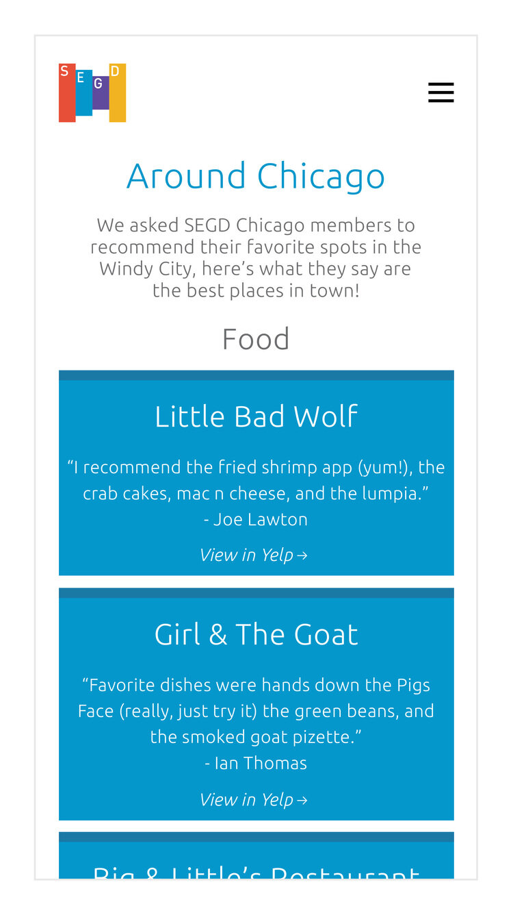
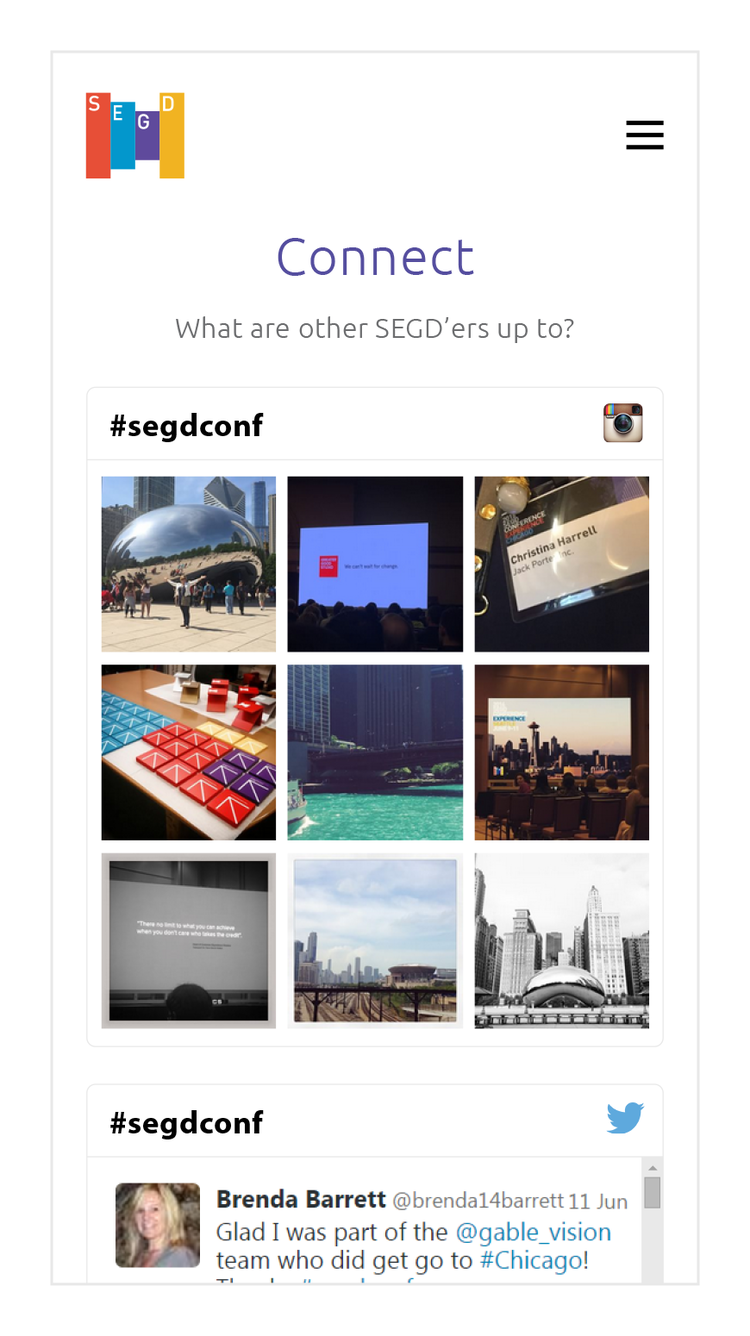
- See the full conference schedule
- See what's up next
- Learn about a speaker or session
- Find a place to eat or relax nearby
- Do all of this fast and frictionless
Strategy: native or web?
Reducing friction was a topic that came up repeatedly. Because conferences can be chaotic environments with congested networks, attendees were unlikely to search for and download a native app. They also mentioned temporary value–they’re unlikely to install a native app that doesn’t provide long-term benefits. To address these pain points, I decided to build a lightweight web app at a short, memorable url.

Sketches and wireframes
The guide set out to solve a small set of attendees’ problems, and do so with a fast, intuitive interface. These focused goals influenced the user experience and content architecture.


Prototyping
The early prototypes were made with Marvel and tested with design professionals. As I collected feedback and the prototypes became more sophisticated, they were made with HTML and CSS, which became the foundation for the final product.

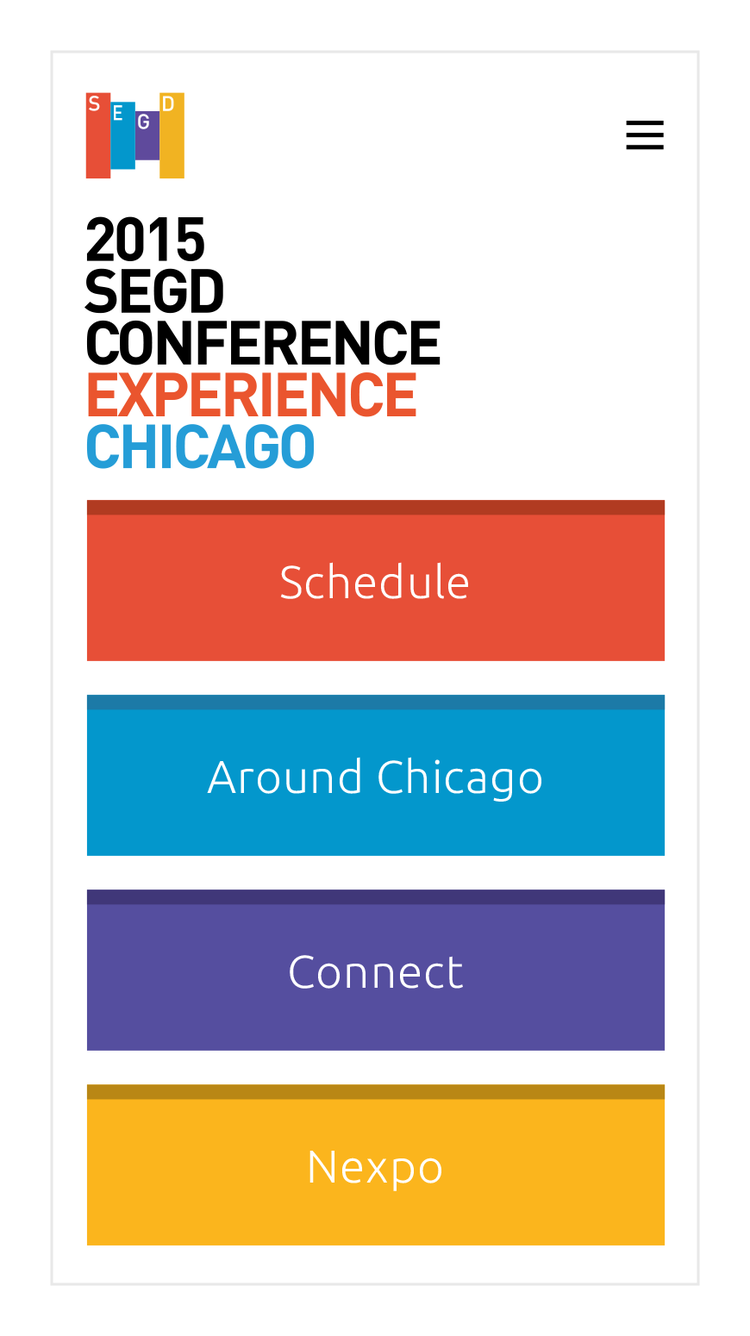
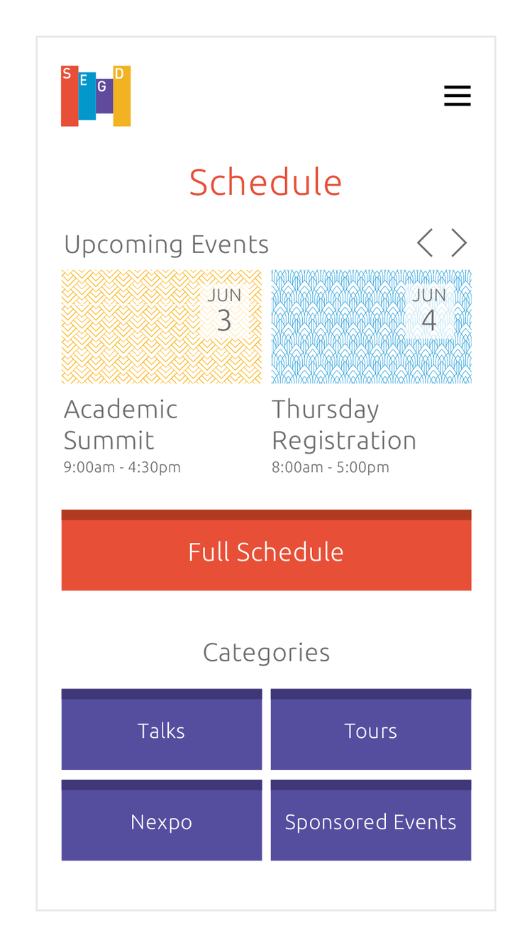
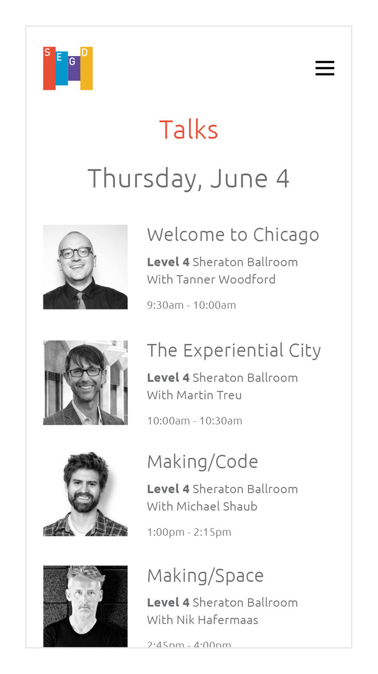
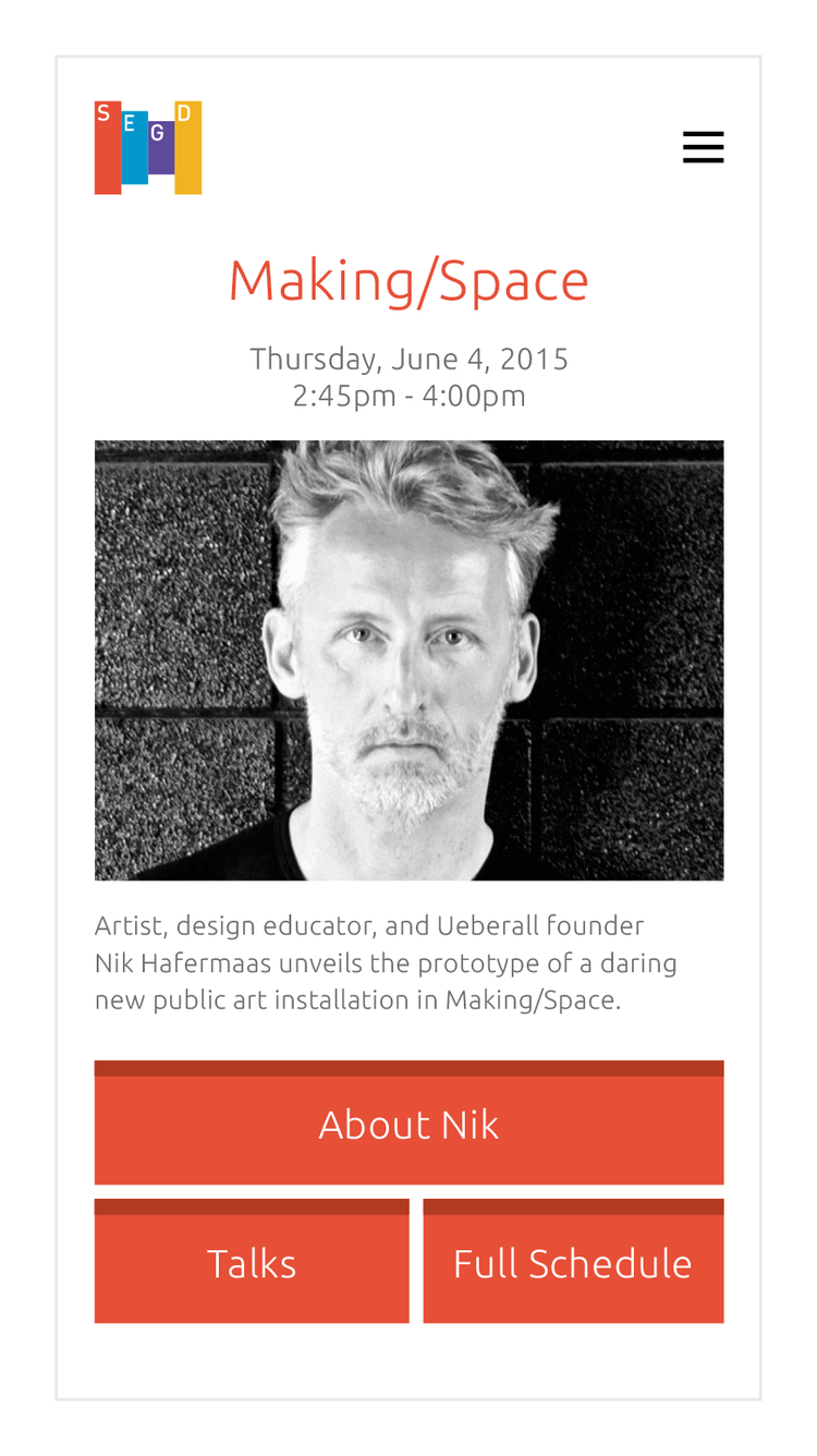
Final product
The major success of the mobile guide was that it was humble. It didn't intimidate users by trying to do everything, it satisfied them by doing a few important things well.
The guide was announced at the conference's kick-off event, and saw modest but promising adoption. I got this anecdotal feedback from an attendee who didn't know I was responsible for the mobile guide: "This is great, I'm surprised they were able to pull it off."

More work

UX writing
Words for user interfaces

Valerio Dewalt Train
Website for the award-winning architecture and design studio

Spectrum
A striking wayfinding system for Adobe

Other stuff
Fine art, logos, music videos, and a bunch of other stuff