
UX Writing
I’m a designer turned writer, so I approach content as a design challenge. I ask questions, think about systems, test alternatives, and iterate a lot.
Here are some things I’ve written for user interfaces. These are all samples of content I stumbled across that I felt needed improvement; they’re speculative and none of them are live.
Account selection flow
Helping banking customers open a new account

Problems
- Long sentences and paragraphs
- Features are buried
- Passive voice
- Readability Score: 8.6* Using the Flesch-Kincaid grade level.
Lower scores are more readable.

Solutions
- Formatting improves scannability
- Features are front and center
- Active voice
- Readability Score: 4.0* Using the Flesch-Kincaid grade level.
Lower scores are more readable.
Approach: Preventing fatigue
The original flow buried the most important details within long sentences, forcing users to read the entire text before they could make a decision and continue through the flow. Requiring this much reading is fatiguing and likely to drive users away.
Stripping away unnecessary words and highlighting key features allows users to quickly scan the list, confidently make a decision, and continue. This also cuts the reading time nearly in half, so they can complete the flow much quicker and move on to opening their account.
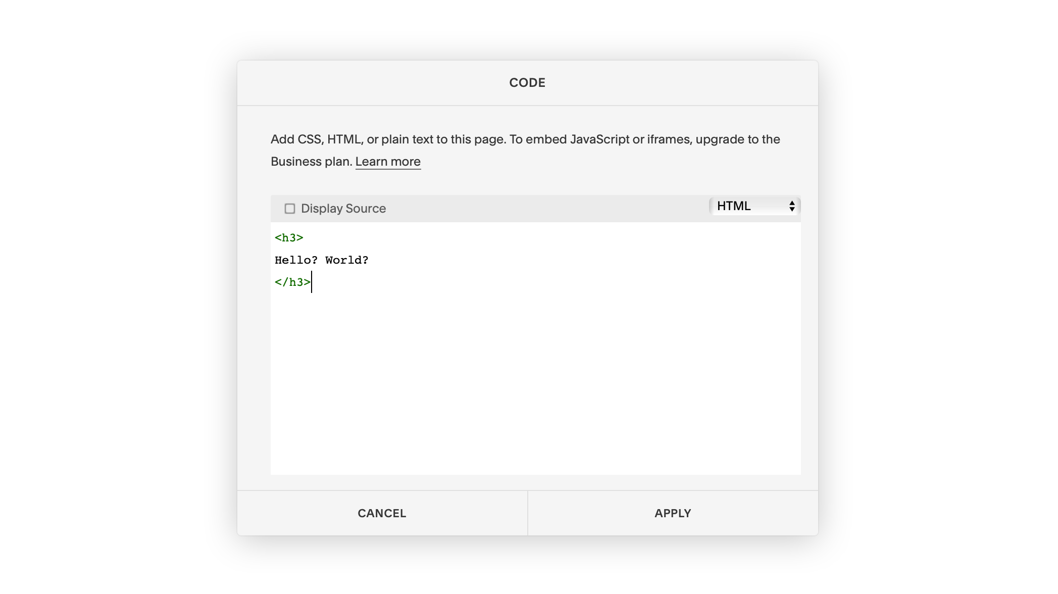
Warning dialog
Warning users that their changes will be lost if they exit without saving

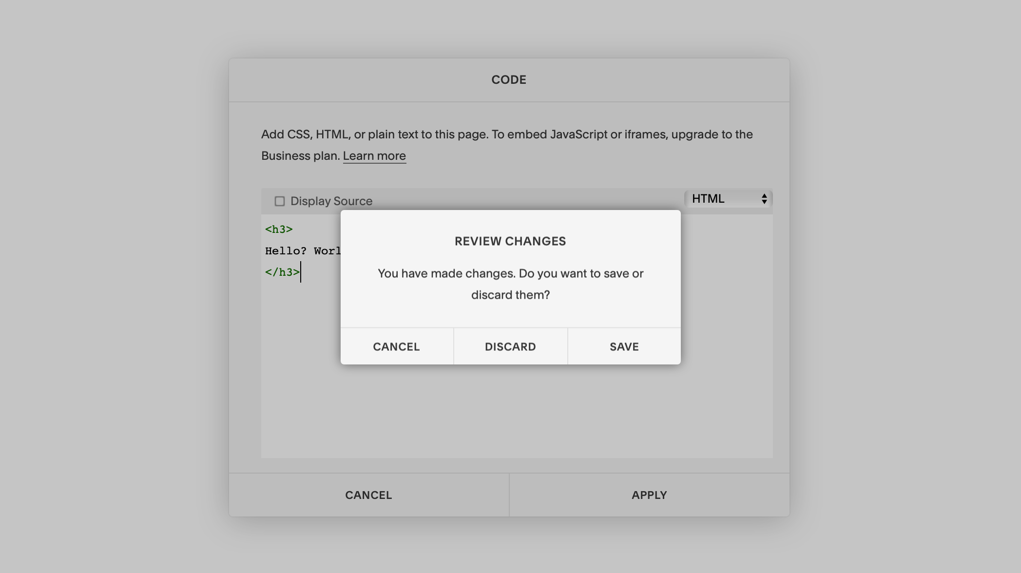

Problems
- Misleading header–users can't review in this state
- Doesn't guide the user to save
- Three options create confusion
- Wrong action is consequential
- All caps hurts legibility
- Localization challenge: cancel and discard are synonymous in other languages
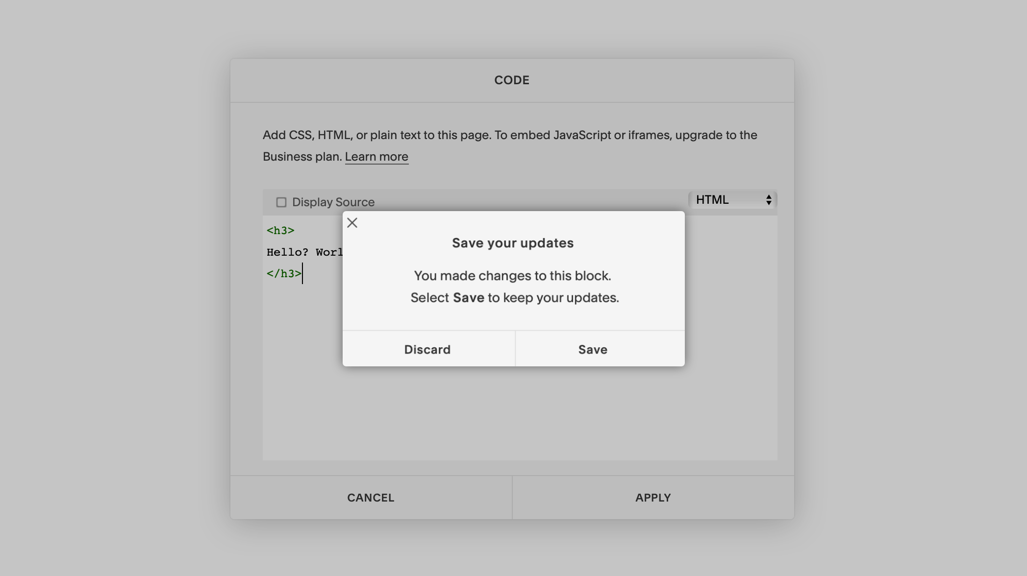

Solutions
- Brings the ask to the header
- Body describes why and how
- Two distinct actions
- Dismissal moved to X-to-close
- Sentence case improves legibility
Approach: What, why, and how
The original dialog had a misleading message and confusing button labels, creating a situation where the user could lose valuable data if they took the wrong action.
The updated dialog immediately states what action is being suggested in the header. The body follows with why this message is being presented and how to proceed. This is all communicated in plain, unambiguous language so the user can act with speed and confidence.
Help doc
Troubleshooting issues when uploading audio tracks

Problems
- Wall of text
- Overly casual tone inappropriate for the situation
- Resolutions are buried

Solutions
- Conversational structure improves scannability
- Instructive tone more suitable for resolving issues
- Resolutions are front and center
Approach: Need a fix, not a friend
When someone needs help, they’re likely frustrated and extra-sensitive to social cues like tone of voice. If you ignore this emotion when communicating to them, it’s easy to aggravate that frustration. The original help doc buried resolutions inside long blocks of text that spoke in the brand’s friendly and animated voice. The user had to waste valuable time reading needlessly long paragraphs, and they product sounded unconcerned with their state of mind.
The updated doc shifts to a neutral, instructive tone. It also adopts a conversational structure (user states an issue, the product responds) so they can scan the list quickly and find their resolution. Tailoring content to the user’s mindset will resolve issues quicker, and build trust by expressing empathy.
Banking feature
Encouraging banking customers to add a new feature to their account

Problems
- Important info buried
- Long sentences
- Passive voice
- Readability Score: 8.9* Using the Flesch-Kincaid grade level.
Lower scores are more readable.

Solutions
- Important info front and center
- Short, digestible sentences
- Active voice
- Readability Score: 6.1* Using the Flesch-Kincaid grade level.
Lower scores are more readable.
Approach: No time for small talk
When writing for a banking interface it’s critical to understand that mobile banking is a highly-used product type with well-established critical paths. The user presumably has one goal for their session that they’ve completed many times before. The original feature description was instead written for a user who’s exploring–using relaxed, casual language and long sentences.
The updated description gets right to the point to capture the user’s attention. It cuts the character count in half, stating in plain language what the feature does and its value. Since it’s more likely the user will read the entire text, it’s more likely they’ll adopt the feature.
Beta test email
Directing testers to download a beta

Problems
- Tries to do too much
- Poorly structured
- Unnatural language
- Tone varies
- Readability Score: 5.7* Using the Flesch-Kincaid grade level.
Lower scores are more readable.

Solutions
- Concise, to-the-point
- Brings the ask to the header
- More natural language
- Consistent, personal tone
- Readability Score: 4.3* Using the Flesch-Kincaid grade level.
Lower scores are more readable.
Approach: Guiding the way
The goal of this email is to get testers to download the beta, but the original content’s scope and structure weren’t focused around this goal. It was trying to communicate too much in one place, and didn’t guide the user to download.
In the updated email, the header and CTA work together to swiftly guide the user to download the beta. The header immediately states the requested action, and the simplified CTA reasserts that action. The content in the body compliments the experience, but users don’t need to read the body to know what to do.
User manual
Documenting a desktop design app's toolbar

Problems
- Uses jargon
- Not scannable, long sentences and paragraphs
- Passive and feature-focused
- Readability Score: 7.6* Using the Flesch-Kincaid grade level.
Lower scores are more readable.

Solutions
- Describes interactions in plain language
- Scannable and to-the-point
- Active and user-focused
- Readability Score: 4.3* Using the Flesch-Kincaid grade level.
Lower scores are more readable.
Approach: Education for everyone
The original documentation explained interactions out of order and used overly technical language. (LMB means select if you were wondering.) This made learning more difficult, and potentially alienated users.
The updated doc explains how to interact with the toolbar in logical order and plain language. Even the least technical user can continue their learning feeling comfortable and confident.
Empty state
Telling users their content failed to load

Problems
- Humor could aggravate frustrated users
- Shoe metaphor is unclear
- Doesn't state the problem
- No reassurance or solution

Solutions
- Adopts neutral tone
- Takes ownership
- States the problem
- Offers multiple solutions
Approach: Always empathize
The original error message was written with good intentions, but failed to consider the user’s mindset in the situation. They’re likely stressed, hurried, and may have encountered this message many times.
The updated error message empathizes with the user, takes ownership, and offers multiple paths to a resolution. This gives the user more control and builds trust by being honest and supportive.
More work

Valerio Dewalt Train
Website for the award-winning architecture and design studio

SEGD15
A lightweight mobile guide for SEGD's national conference

Spectrum
A striking wayfinding system for Adobe

Other stuff
Fine art, logos, music videos, and a bunch of other stuff